

Theory
Typical value and position: mean, median, quartiles
Mean, median, mode and trimmed mean, quartiles, percentiles and the IQR (two ways to compute them), a seasonal index, and the cumulative share curve.
~8 min read · 9 exercises · 250 points
Before you start
Averages and shares of shares
You're still on Klasna's product team. Most reports boil a whole list down to one number, an average or a share, and module 3 asks: when does that one number tell the truth?
Over four lessons: typical values and positions, weighted means and mix, shares of shares in funnels, and choosing the right denominator. This first lesson covers the mean, the median, quartiles and percentiles, seasonal indices and the cumulative share curve.
The mean: a balance point
The mean is the sum divided by how many: x̄ = Σxᵢ ÷ n. Ten learners took 2, 3, 4, 4, 5, 6, 7, 8, 9 and 22 lessons in April, 70 in all, so the mean is 7.
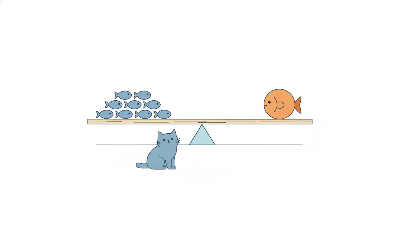
Think of the mean as the balance point of the list on a seesaw: every value pulls with its distance, and a value far out pulls hard. Only four of the ten learners took 7 or more; the one with 22 lessons drags the mean up on its own. Had that learner taken 10, the sum would be 58 and the mean 5.8.
That sensitivity is both the mean's strength and its weakness. It uses every value, which is what you want for totals: the mean times n gives back the sum, so it's the right figure for planning tutor hours or revenue. But as a picture of a "typical" learner it can describe almost nobody when the list has a long tail.
- DoMean × n = 7 × 10 = 70 lessons: right for planning totals
- Don't"The typical learner takes 7 lessons"
Only 4 of 10 took 7 or more.
The median: the middle of the sorted list
The median is the middle value after sorting, the value with half the list at or below it. It ignores how far the extremes are, so one heavy user can't move it.
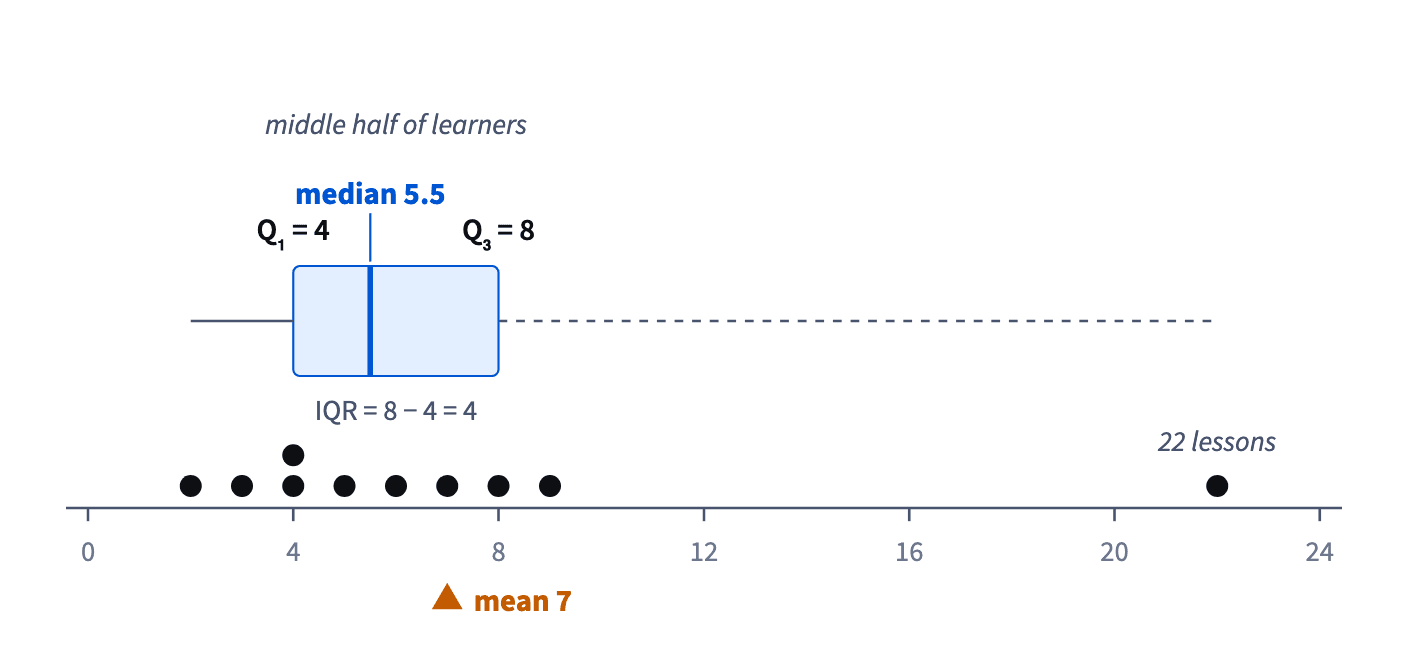
With n odd it's the single middle value. With n even there is no single middle, so it's the mean of the two middle ones. For 2, 3, 4, 4, 5, 6, 7, 8, 9, 22 (n = 10) the middle pair is 5 and 6, so the median is 5.5. Change the 22 to 220 and the median stays 5.5, while the mean jumps to 26.8.
Two slips: forgetting to sort first, and taking just one of the two middle values when n is even.
Use the median to describe a typical member of a skewed list: lessons per learner, spend per customer, time on site. It says "half took this many or fewer", which a reader can picture.
- DoSorted 2 … 22, middle pair 5 and 6, so the median is 5.5
- Don'tThe median of 3, 9, 4 is 9, the middle as listed
Sort first, 3, 4, 9, so it's 4.
Trimmed mean and mode
Between the mean and the median sits a compromise, the trimmed mean. Drop the most extreme values at both ends, often a fixed share such as 10% from each side, and average the rest.
For 2, 3, 4, 4, 5, 6, 7, 8, 9, 22, dropping one value from each end leaves 3 to 9, which add up to 46: 46 ÷ 8 = 5.75. Unlike the median, it still uses most of the data; unlike the mean, one heavy user no longer runs it.
Trim the same number from both ends. Dropping only the big value is not trimming; it's deleting an inconvenient number.
The mode is the most frequent value: 4 in this list, taken by two learners. It's most useful for categories and for values that repeat a lot, such as the most popular package size. In a list where every value is different, there's no useful mode.
- DoDrop 2 and 22, average 3 … 9, get 5.75
- Don'tDrop only the 22 and average the rest
One-sided, so biased low.
Mean above median: a skew signal
Comparing the mean with the median tells you the shape of a list without drawing it.
- Mean well above the median: a long right tail, a few large values pulling the mean up. Revenue, lessons per learner and time on site usually look like this.
- Mean well below the median: a tail of small values pulling it down.
- Mean close to the median: roughly symmetric.
Picture: The box holds the middle half; the mean is pulled toward the tail. · shown above
Learners' monthly spend with a mean of 1,850 UAH and a median of 1,240 UAH is right-skewed: half spend 1,240 or less, and a few big spenders lift the mean. So "most learners spend more than 1,850" is impossible.
Neither number is wrong. For a skewed list, report the median as the typical value and keep the mean for totals. When the gap is large, say so: it's information about the customers, not noise.
- Do"Median spend 1,240 UAH; a few big spenders lift the mean to 1,850"
- Don't"A typical learner spends 1,850 UAH"
Most spend less.
Quartiles and the IQR
The median splits the sorted list in two. Quartiles split it in four: Q₁ is the median of the lower half, Q₃ the median of the upper half. For 2, 3, 4, 4, 5 | 6, 7, 8, 9, 22, the lower half gives Q₁ = 4 and the upper half Q₃ = 8.
The IQR, the interquartile range, is Q₃ − Q₁ = 4: the width of the middle half of the list. Unlike the full range, 22 − 2 = 20, it ignores the one heavy user, so it describes the spread of typical learners. The outlier fences from module 2 are built on it: 4 − 1.5 × 4 = −2 and 8 + 1.5 × 4 = 14, so the learner with 22 lessons is flagged.
When a half has an even number of values, its median is again the mean of its two middle values. With n odd, a common convention leaves the overall median out of both halves.
Picture: The box holds the middle half; the mean is pulled toward the tail. · shown above
- DoLower half 2, 3, 4, 4, 5, so Q₁ = 4
- Don'tIQR = max − min = 20
That's the full range.
Percentiles and the spreadsheet method
A percentile generalizes the idea: the p-th percentile is the value with p% of the list below it. The 90th percentile of lessons per learner is the level that only the top tenth exceed. Quartiles are the 25th and 75th percentiles, the median the 50th.
Spreadsheets compute them by interpolation. QUARTILE.INC and PERCENTILE.INC place the p-th percentile at position 1 + (n − 1) × p of the sorted list; if that position falls between two values, they go the matching share of the way between them. For the ten values 2 … 22, Q₃ sits at position 1 + 9 × 0.75 = 7.75, three quarters of the way from x₍₇₎ = 7 to x₍₈₎ = 8: 7.75, not the 8 of the halves method.
Picture: The box holds the middle half; the mean is pulled toward the tail. · shown above
Both methods are accepted, and they differ most on short lists. What matters is saying which one you used and never comparing a quartile from one method with a quartile from the other.
- Do"Q₃ = 7.75 (QUARTILE.INC)"
- Don'tComparing a halves-method Q₃ with a spreadsheet Q₃
The gap may be only the method.
Seasonal index: month ÷ average month
Averages also tame seasons. A seasonal index is a month divided by the average month. Klasna averages 6,000 lessons a month over the year; May brings 9,620, so May's index is 9,620 ÷ 6,000 ≈ 1.60, or 60% above a typical month. An index below 1 marks a quiet month.
The index defuses a common trap: a May with 9,620 lessons isn't growth, it's just May. To compare months fairly, divide each by its index: 9,620 ÷ 1.60 ≈ 6,000, a seasonally adjusted figure you can set next to a quiet month adjusted the same way.
The twelve indices of a year average to 1, because each is measured against the average month. If yours don't, the average or one of the indices is wrong.
Compute indices from more than one year when you can; a single year mixes the season with whatever else happened that year.
- DoMay 9,620 ÷ 1.60 ≈ 6,000, seasonally adjusted
- Don't"May is 60% above the average month, so we're growing"
That's the season, not growth.
The cumulative share curve
A cumulative share curve shows, for every x, the share of the list with x or fewer. For the ten learners: 40% took 4 lessons or fewer, 60% took 6 or fewer, 90% took 9 or fewer and 100% took 22 or fewer.
Positions can be read straight off it. Where the curve crosses 50% is the median; 25% and 75% give Q₁ and Q₃; 90% gives the 90th percentile.
Put two groups on the same chart and compare. A curve that is higher at some x has more of its members at or below x, so more light users. Where two curves cross, the order flips: below the crossing one group has more light users, above it the other catches up.
How it fits together: the mean is a balance point, the median and quartiles are positions in the sorted list, and the curve shows every position at once. Next lesson: the weighted mean, where some values count more than others.
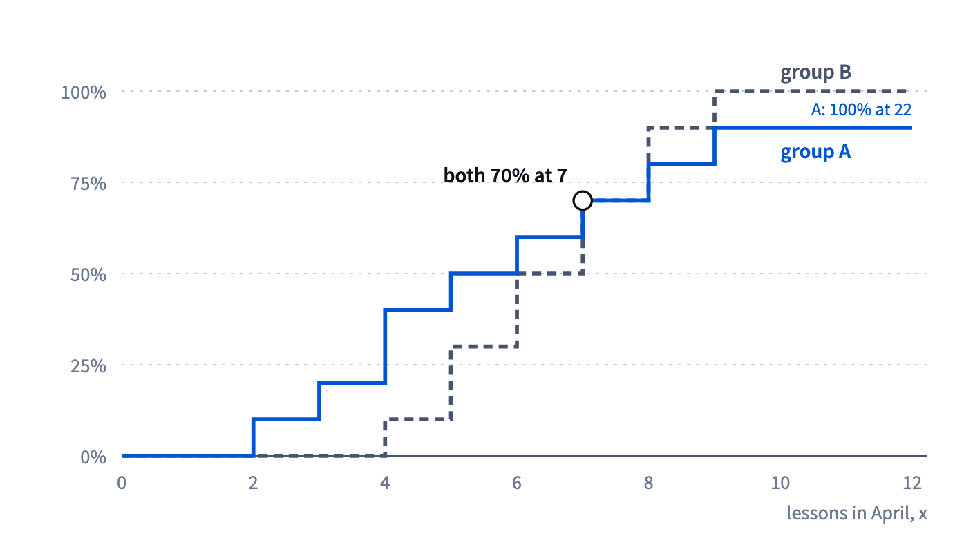
- DoThe curve crosses 50% at 5.5 lessons: the median
- Don'tReading the height at x as "share with more than x"
It's x or fewer.
Ready to practise?
Answer the lesson's exercises and earn 250 points the first time you finish it.
Start the exercises