

Theory
Losses hurt twice: checking, herding, chasing and bubbles
How loss aversion, checking too often and following the crowd lead to selling low and buying high.
~8 min read · 8 exercises · 250 points
Before you start
More checks, more selling?
Still September at Zapas, a few days after the behavior-gap numbers. As the PM you own the notifications, and Ethan has two ideas for launch: an evening push with the day's portfolio change, and a "Trending" banner on Robo Theme.
Before building either, you'll look at what the beta users did in the spring drop, split by how often they opened the app. Then you'll see why losses weigh more than gains and how crowds chase what's hot.
Checking often and selling
In Zapas's beta year the world fund fell 22% in spring and finished the year at +8.7%. Who sold everything in the drop depended strongly on how often people looked:
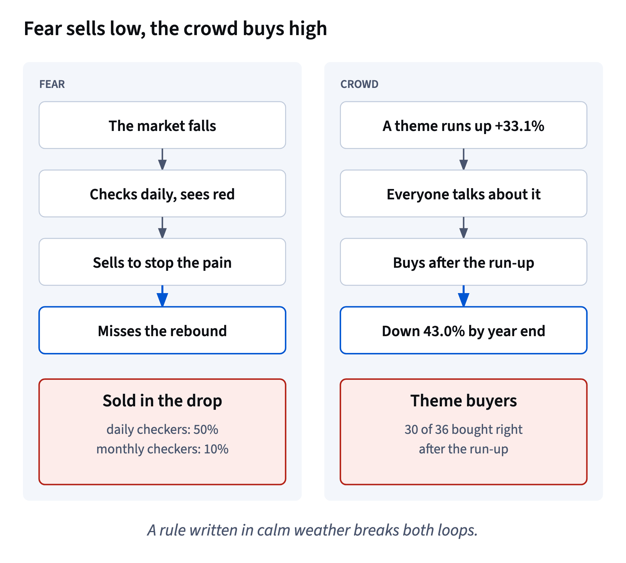
- checked daily: 25 of 50 sold, 50%;
- checked weekly: 20 of 80, 25%;
- checked monthly: 7 of 70, 10%.
The selling rate of daily checkers was five times that of monthly checkers. Always compare shares of each group: the raw counts (25, 20, 7) mix the behavior with the size of the group.
Why would looking more lead to selling more? Short periods are noisy: the shorter the window, the more often it shows a loss. Someone who looks once a month saw four red months this year; someone who looks once a year saw a single green number, +8.7%. Each look at a loss is a small sting, and many stings in a row push people to make the pain stop.
Chart data
| How often they checked | Sold everything, % |
|---|---|
| Checked daily | 50 |
| Checked weekly | 25 |
| Checked monthly | 10 |
- Do25 ÷ 50 = 50% vs 7 ÷ 70 = 10%, five times higher
- Don't"25 sold vs 7 sold: 3.6 times more."
The groups have 50 and 70 users.
Going together is not causing
The beta shows a clear pattern: the more often users checked, the more of them sold in the drop. It's tempting to read it as "checking causes selling". The data can't say that.
Chart: Share of beta users who sold everything in the drop, by how often they checked (synthetic) · shown above
The users chose how often to look. People who check every evening may differ in other ways: more anxious, newer to investing, more money at stake. Any of those could drive both the checking and the selling.
What the pattern does give you:
- a strong hint for product design: don't make the short-term number the loudest thing on the screen;
- a hypothesis to test: give half of new users a weekly summary instead of a daily one and compare how many sell in the next fall.
Say "users who checked daily sold more often", not "checking daily made them sell". The first is what you measured; the second needs an experiment.
- Do"Users who checked daily sold five times as often."
- Don't"Daily checking makes users sell, so we hide all numbers."
Loss aversion, and why it hurts twice
Loss aversion is the tendency to feel a loss more strongly than a gain of the same size. Losing 100 dol. usually stings more than finding 100 dol. pleases.
For an investor, a fall hurts twice:
- On the screen. The balance is lower; nothing has been lost for good yet, but it feels like it.
- On the sale. Selling turns the paper loss into a real one and removes any chance of the rebound.
The first sting is unavoidable, but how often you feel it depends on how often you look. In Zapas's beta year the world fund had four red months (months 3 to 6) and ended at +8.7%. A once-a-year look sees one green number; a monthly look sees four losses; a daily look sees dozens of red evenings.
A product can't remove loss aversion. It can choose how often it shows people a loss, and what it shows next to it: the horizon, the plan, the year so far.
Chart data
| Month | Zapas World Stock | Robo Theme |
|---|---|---|
| 0 | 100 | 100 |
| 1 | 103 | 110 |
| 2 | 105.1 | 123.2 |
| 3 | 100.9 | 133.1 |
| 4 | 91.8 | 113.1 |
Show 8 more rows
| 5 | 84.4 | 92.7 |
| 6 | 81.9 | 81.6 |
| 7 | 86 | 77.5 |
| 8 | 91.2 | 79.1 |
| 9 | 94.8 | 75.9 |
| 10 | 97.7 | 76.7 |
| 11 | 103.5 | 74.4 |
| 12 | 108.7 | 75.9 |
- Do"Down 3% this month. Since you started: +11%. Your plan: 10 years."
- Don't"−0.8% today" in red, every evening
Herding and performance chasing
Herding is doing what many others are doing because they are doing it. Performance chasing is buying whatever has just risen most. They usually travel together: a rise gets attention, attention brings buyers, and the buyers arrive late.
In Zapas's beta year Robo Theme rose 33.1% in the first three months. Of the 36 users who bought it, 30 (83.3%) bought at the start of month 3 or 4, right after the run-up. From the start of month 4 to the year end the theme lost 43.0%, while the world fund gained 7.8%. For the whole year the theme was −24.1%.
1,000 dol. moved at the start of month 4 became 570 in the theme instead of 1,078 in the world fund.
A past rise is a fact about the past. It tells you the price is higher now, not that it will keep rising. A product that points at "what rose most" sends its users to buy high.
Chart: 100 dol. in Zapas World Stock vs Robo Theme through the beta year (synthetic) · shown above
- Do1,000 × 0.570 = 570 vs 1,000 × 1.078 = 1,078
- Don't"It's up 33% in three months, so it's working."
The shape of a bubble
A bubble is a stretch when prices rise far beyond what the underlying businesses can earn, pushed mainly by buyers who expect prices to keep rising.
It usually follows a recognisable path:
- a real story: a new technology or idea that will matter;
- early rises in anything linked to it;
- the rise becomes the news, and people who never invested start asking how to get in;
- late buyers pile in, with "it only goes up" as the main argument;
- a hard fall, often to below where the story began;
- late buyers sell at a loss, and many leave investing for good.
In our synthetic history the Tessaro Tech Theme index rose 2.56 times in years 30–34 (+28, −6, +34, +22, +30%) and then lost 55.3% in years 35–37 (−30, −24, −16%): 2.56 × 0.447 ≈ 1.14, so five hot years and three cold ones left it only about 14% above where it started. The story can be true and the price still wrong. A narrow theme fund is a concentrated, active bet, and it belongs, if anywhere, in a small capped "play" part of a portfolio.
- Do"The story may be right; the price already counts on it."
- Don't"Everyone I know is buying it, so I can't lose."
Speculation, crypto and the play part
The course splits money into saving (safe, available), investing (owning businesses or lending, for years) and speculating (betting that someone will pay more later).
A broad stock fund has profits behind it; a bond has interest. That's why you can reason about a long-run range for them. A narrow theme bought after a run-up, or a crypto-asset, has no such engine you can estimate: crypto pays no profits or interest, so its price is only what the next buyer will pay. That makes it speculation, whatever the marketing says.
Speculation isn't forbidden; it just needs a fence. If a user wants a theme or a coin, the honest design is a small, capped play part of the plan, money they can afford to lose completely, kept apart from the core.
And a banner that sells "trending" or "join thousands of investors" is herding with a button attached.
- Do"Play part: a cap I set myself, say 3–10% of my plan, money I can lose."
- Don't"Crypto is the new savings account."
Notifications that don't feed the traps
Every notification is an invitation to act. For a long-term investing app the question is which actions you are inviting.
Choices that tend to help:
- Monthly by default. In the beta, monthly checkers sold in the drop at a fifth of the rate of daily ones. Let users opt in to more if they want.
- Long view first. Change since they started, their goal and horizon, then the short-term change.
- Prepared messages for falls, written in advance with honest numbers and the user's own plan, instead of raw daily figures.
- Measure it. Test the new default against the old one and count sales in the next fall, not just app opens.
Choices that tend to hurt: drop alerts, daily red and green numbers, "best performers" lists and anything that turns a recent rise into a call to buy. Engagement that ends in a panic sale is not a win for the user or for the product.
- Do"October summary: since you started +9%. Goal: 2037. This month −2%."
- Don't"Ouch! −1.4% today. Tap to see your losses."
Replacing a notification, step by step
A notification redesign has four decisions, and each should trace back to evidence:
- Frequency: what the default is and who can change it. The beta link (50% of daily checkers sold in the drop vs 10% of monthly ones) argues for a calmer default, with more frequent updates as an opt-in.
- Order of information: the long view first (since start, goal, horizon), the short-term change below it.
- Falls: a message prepared in advance with the size of the fall and the user's own plan, instead of a red number at night.
- Proof: a test on new users, measured by selling in the next fall or by the behavior gap, not only by opens.
Chart: Share of beta users who sold everything in the drop, by how often they checked (synthetic) · shown above
Name the limits too: the beta shows a link, not a cause, which is exactly why the test matters.
- Do"Monthly by default; success = fewer sales in the next fall."
- Don't"Success = more daily opens."
Ready to practise?
Answer the lesson's exercises and earn 250 points the first time you finish it.
Start the exercises