

Theory
Candles and timeframes
Read one candle in a few seconds, and see how a calm week can hide one frightening day.
~9 min read · 9 exercises · 250 points
Before you start
What is a price chart telling me?
You still have your Pebble practice account: 10,000 practice dollars and a small made-up market where nothing real is at stake. This module asks one question: what is a price chart actually telling you, and what is it not?
This first lesson starts with the smallest piece of a chart, one candle. You will read its four numbers, measure a day's range and body, and see how a frightening red day on Bluefin Energy turns into a calm green week when you change the timeframe.
From a line to candles
A price chart is just a list of past prices drawn as a picture. The simplest kind, a line chart, takes one price per period, usually the last one of the day (the close), and joins the dots. It shows the general direction cleanly, which is why apps put it on their home screens.
Chart data
| date | Close |
|---|---|
| 2026-02-06 | 45.14 |
| 2026-02-09 | 45.59 |
| 2026-02-10 | 45.95 |
| 2026-02-11 | 44.11 |
| 2026-02-12 | 44.77 |
Show 1 more row
| 2026-02-13 | 45.75 |
What a line hides is the trip inside each day. Bluefin Energy can open at 45.95, wander to 46.05, sink to 43.88 and close at 44.11: the line only remembers 44.11.
A candlestick chart keeps more of that trip. Each candle stores four prices for one period: where it started, its top, its bottom and where it finished. You lose a clean line and gain a sense of how far the price travelled and where it settled.
Neither picture is a forecast. Both are records of what already happened.
- Do"The line shows the closes went up this month; the candles show how wild each day was."
- Don't"The line was smooth, so nothing much happened during the day."
A line of closes can't show a day's trip.
Four numbers in one candle
A candlestick, or candle, squeezes one period of trading into one shape. On a daily chart one candle is one day; on a weekly chart, one week.
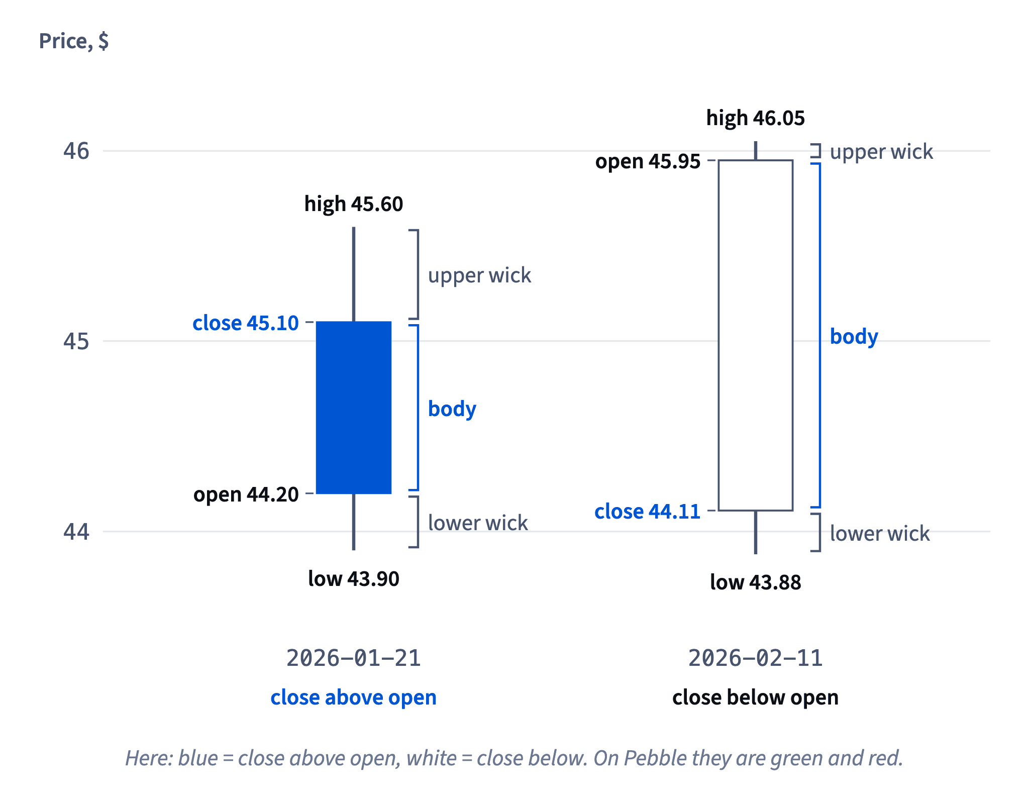
Every candle stores four prices, often written as OHLC: the open (the first price of the period), the high (its top), the low (its bottom) and the close (the last price).
- The body is the fat block between the open and the close.
- The wicks are the thin lines above and below it: how far the price wandered beyond the body before coming back.
- The colour says which way the period went: on Pebble, green when the close is above the open, red when it is below.
Picture: Body from open to close, wicks to the top and bottom of the day. · shown above
On 2026-01-21 Bluefin Energy opened at 44.20, reached 45.60, dipped to 43.90 and closed at 45.10: a green candle with a 0.90 body, a 0.50 upper wick and a 0.30 lower wick.
- Do"Green, small body, long upper wick: it went up a little and gave back most of the top."
- Don't"The wick is where the price will go next."
A wick records where the price already went and came back from.
What the colour does and doesn't say
A candle's colour answers one narrow question: did this period finish above or below where it started? On Pebble, close above open is green, close below open is red.
It does not compare with the day before. Suppose Northwind Foods closes at 50.00 on Monday, opens Tuesday at 50.80 after good news, and drifts to 50.40 by the close. Tuesday's candle is red (50.40 is below 50.80), yet the share ended the day 0.40 higher than Monday.
Colour also says nothing about size. A red candle with a 0.02 body and a green one with a 2.00 body are both just "one colour". Look at the body and the wicks to judge how big the move was.
Some apps let you swap the colours or use hollow and filled bodies. Check the legend before reading anything into the colour.
- Do"Red today, but the close is still above yesterday's close: it opened with a jump."
- Don't"Three red candles in a row, so the price has fallen three days running."
Each red candle only compares its own open and close.
Range and body: how big was the day?
Two quick subtractions tell you the size of any candle.
- Range = high − low: the whole distance the price travelled in the period.
- Body = the distance between open and close (ignore the sign): how far it ended up from where it started.
For Bluefin Energy on 2026-01-21 (open 44.20, high 45.60, low 43.90, close 45.10): range = 45.60 − 43.90 = 1.70, body = 45.10 − 44.20 = 0.90. The rest of the range is wicks: 0.50 on top and 0.30 below.
Picture: Body from open to close, wicks to the top and bottom of the day. · shown above
Comparing the two gives the candle's character. A body close to the range means the price moved one way and stayed there. A small body inside a big range means it travelled far and came back.
Both describe the day that's over. A big body today doesn't mean a big body tomorrow, and a long wick isn't a signal by itself.
- Do"Range 1.70, body 0.90: about half the day's travel stuck."
- Don't"Range = close − open."
That's the body. The range runs from the low to the high.
A candle forgets the route
A candle is a summary, like the total on a receipt: you see the sum, not each item. It keeps four prices (open, high, low, close) and throws away the order in which they happened.
Take Bluefin Energy on 2026-01-21: open 44.20, high 45.60, low 43.90, close 45.10. The price could have dipped to 43.90 in the morning and climbed to 45.60 later. Or it could have spiked to 45.60 first, crashed to 43.90 and recovered. Both days draw exactly the same green candle.
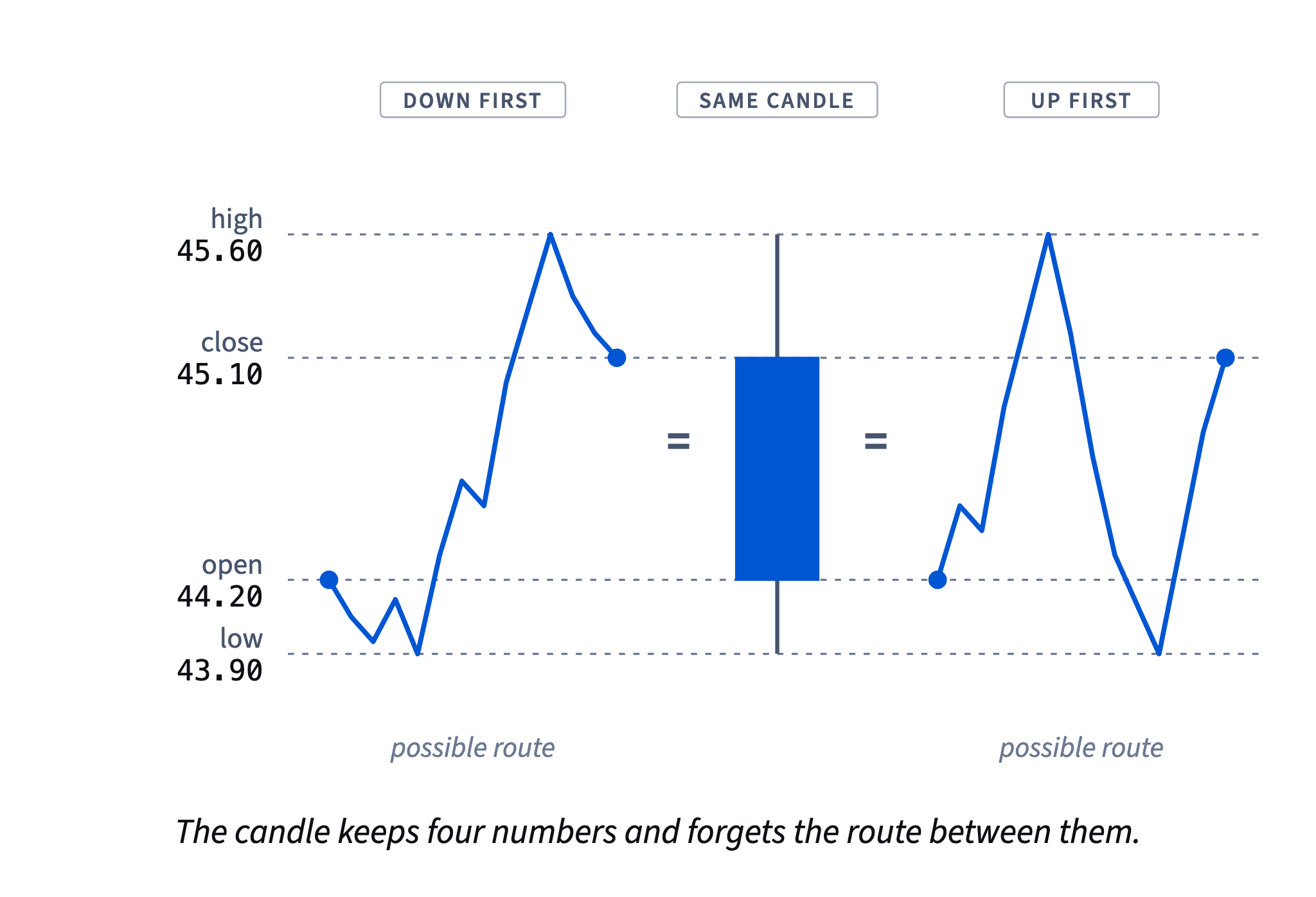
This matters when you imagine a trade. If a stop had sat at 44.00 and a target at 45.50, the candle can't tell you which was hit first. Only a shorter timeframe, such as hourly candles for that day, would show the order.
So don't read a story into one candle's wicks. They record how far the price reached, not when or why.
- Do"Both my stop and my target are inside this candle; I need hourly candles to know which came first."
- Don't"Long lower wick: buyers stepped in at the end of the day."
The candle doesn't record when the low happened.
Timeframe: the same prices at a different zoom
The timeframe is how much time one candle covers: a minute, an hour, a day, a week. Changing it doesn't change the prices, only the zoom.
A longer candle is built from shorter ones. A weekly candle takes Monday's open, Friday's close, the highest high and the lowest low of the five days.
Bluefin Energy, week of 2026-02-09: on Wednesday 2026-02-11 the day opened at 45.95 and closed at 44.11, a fall of (44.11 − 45.95) ÷ 45.95 ≈ −4.0%, the biggest red candle on the daily chart. The week as a whole opened at 45.14 and closed at 45.75: (45.75 − 45.14) ÷ 45.14 ≈ +1.4%, a green weekly candle. Wednesday's fall survives only as its lower wick, down to 43.86.
Chart: Bluefin Energy, week of 2026-02-09, daily closes · shown above
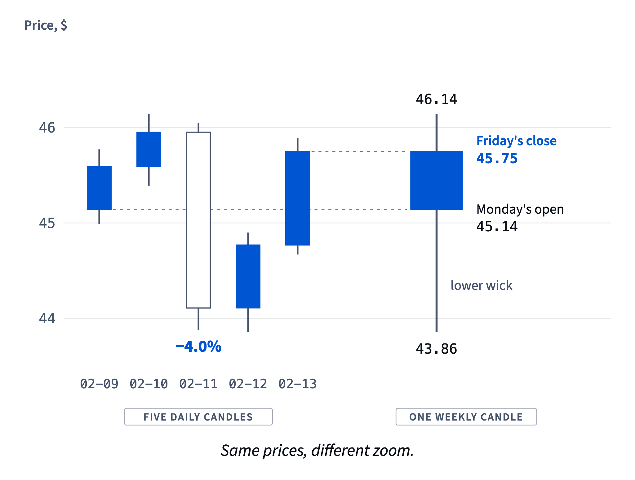
Neither view is the "true" one. The day answers "what happened on Wednesday?", the week answers "where did the week end up?". Over the 40 days, 21 daily candles were red but only 3 of the 8 weekly ones were green: zoom changes the mood, not the facts.
Dataset · 8 rows
Bluefin Energy, the same 40 days as 8 weekly candles
First 5 of 8 rows
- Do"On the daily chart it's a −4.0% day; on the weekly chart it's the wick of a +1.4% week."
- Don't"The weekly chart is green, so Wednesday's fall didn't really happen."
The fall is still there, folded into the wick.
Match the timeframe to your holding time
Which timeframe is "right" depends on one thing: how long you plan to hold a position. Start with candles that each cover a slice of that holding time, then zoom in only for details such as where to put an order.
If Marc holds for two to six weeks, daily or weekly candles show the moves that can make or break his trade. A one-minute chart shows wiggles of a few cents that will mostly wash out over a month.
Too short a timeframe has a real cost. Every small wiggle looks like news, which tempts you into extra trades, and every trade pays the spread and fees from Where the money goes: spread, fees and slippage. It also feeds panic: Nora nearly sold everything on a −4.0% day that ended up inside a +1.4% week.
Picture: The scary day becomes the lower wick of the week. · shown above
Too long a timeframe has the opposite problem: a day trader looking only at weekly candles can't see where the day's risk sits.
- Do"I hold for weeks, so I plan on daily candles and glance at the weekly ones."
- Don't"I hold for a month, but I watch the one-minute chart all day just in case."
Minute noise invites extra trades and costs.
A candle is a record, not a forecast
Everything a candle holds happened already. A big red body says sellers pushed the price down from the open to the close of that period; a big green one says buyers pushed it up. Neither says what comes next.
Nora's candle on 2026-02-11 (45.95 → 44.11, about −4.0%) looked like the start of a collapse. Two days later the week closed at 45.75, up 1.4%. Next time a week like that could just as well close red: a single candle tips the odds neither way, and evidence that one-candle shapes predict much after costs is weak.
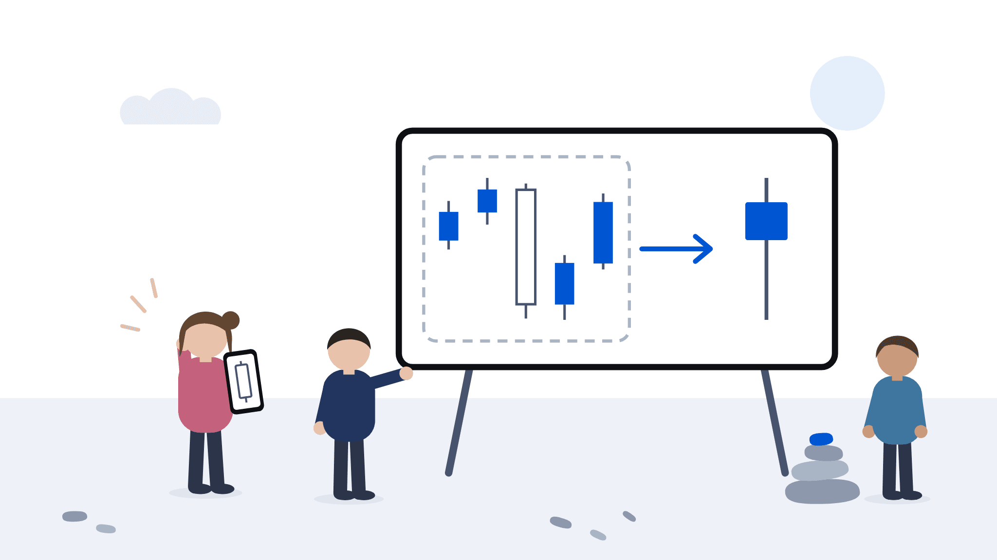
What a candle is good for: describing a day honestly, measuring how big it was, and noticing where the price went and came back from. Decisions belong to a plan with a stop and a position size, read on the timeframe that fits your holding time.
How it fits together: a candle records one period's open, high, low and close; the timeframe sets how much each candle covers; and none of it forecasts. Next, Trend and range reads many candles at once to tell a trending market from a sideways one.
- Do"Sellers won that day by about 4%. What does my plan say?"
- Don't"Huge red candle, it's crashing, sell everything now."
One candle is a thin reason for a big decision.
Ready to practise?
Answer the lesson's exercises and earn 250 points the first time you finish it.
Start the exercises