

Theory
Factor analysis: surveys and NPS drivers
Finding the few hidden themes behind many survey questions.
~11 min read · 11 exercises · 250 points
Before you start
Twenty questions, a few themes
Survey season at CatChow: the product team has the results of the NPS follow-up survey, and the board summary is yours to prepare. The survey has twenty questions, and twenty separate averages would tell the board very little.
In this lesson you'll use factor analysis to find the few hidden attitudes behind many answers, decide how many of them to keep, and give each one a name the board can work with.
Latent factors: the themes behind the answers
A 20-question survey rarely measures 20 different things. People who trust CatChow tend to say they'd recommend it, would buy again and like the brand: several questions echo one attitude. That hidden attitude is a latent factor: something you never measure directly, only through the answers that move together because of it.
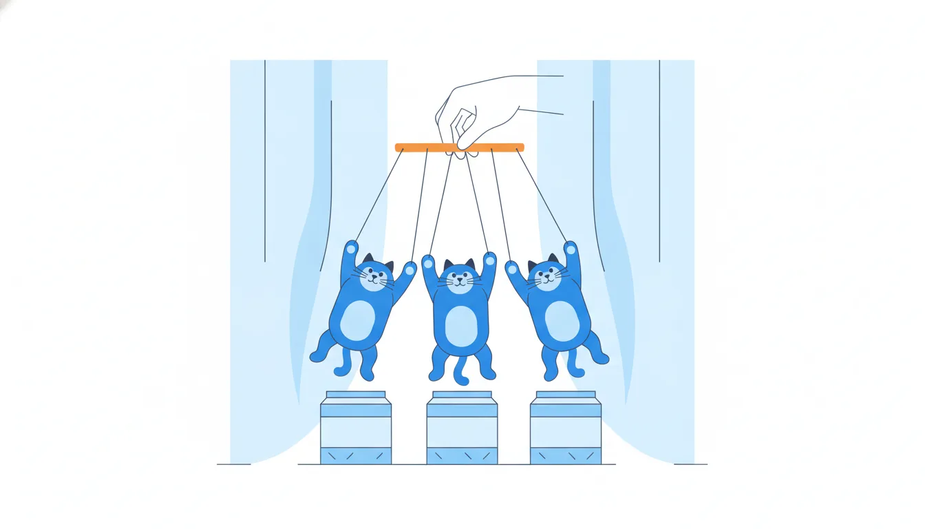
Factor analysis finds these factors. It starts from the correlation matrix: the correlation of every question with every other one. Then it looks for blocks.
With four items:
- Q1 "recommend" and Q2 "trust the brand" correlate at 0.8;
- Q3 "delivery speed" and Q4 "packaging" correlate at 0.75;
- every cross-pair correlates at 0.15–0.25.
Chart data
| Question pair | Correlation |
|---|---|
| Q1-Q2 | 0.8 |
| Q3-Q4 | 0.75 |
| Q1-Q3 | 0.2 |
| Q1-Q4 | 0.15 |
| Q2-Q3 | 0.25 |
Show 1 more row
| Q2-Q4 | 0.2 |
Two tight blocks with weak links between them suggest two factors: one behind Q1–Q2 (something like loyalty) and another behind Q3–Q4 (something like operations).
Two cautions. Correlated items aren't identical: each still carries its own nuance and noise. And a correlation between two answers isn't one answer causing the other; the factor is the simpler explanation of why they move together.
- DoQ1–Q2 at 0.8, Q3–Q4 at 0.75, cross-pairs near 0.2 → likely two factors.
- Don't“Q1 and Q2 correlate at 0.8, so trust makes people recommend us.”
Reads a shared factor as one answer causing another.
Factor loadings and eigenvalues
Once factors are extracted, two kinds of numbers describe them.
A factor loading is the correlation between one item and one factor. Like any correlation it runs from −1 to 1; a loading near 1 means the item almost is the factor, near 0 means it has little to do with it. Each item gets one loading per factor.
An eigenvalue sums up a whole factor: the sum of its squared loadings across all items,
λ = Σ a²
For a factor with loadings 0.8, 0.8, 0.1 and 0.1:
0.8² + 0.8² + 0.1² + 0.1² = 0.64 + 0.64 + 0.01 + 0.01 = 1.30.
Why squares? A squared loading is the share of that item's variance the factor accounts for (0.8² = 0.64, or 64%). Adding them gives the factor's total explained variance, measured in "items' worth". An eigenvalue of 1.30 means the factor explains as much variance as 1.3 standardised survey questions.
The classic slip is adding the loadings without squaring (0.8 + 0.8 + 0.1 + 0.1 = 1.8), which overstates weak items and gives a number with no meaning.
- Do0.8² + 0.8² + 0.1² + 0.1² = 1.30
- Don't0.8 + 0.8 + 0.1 + 0.1 = 1.80
Adds loadings without squaring them.
Reading a loading correctly
Loadings look like percentages, so they get misread in reports. A loading of 0.75 for "delivery speed" on Factor 2 does not mean that 75% of customers care about delivery, or that delivery is 75% of anything.
What it does mean:
- it's a correlation. Respondents who score high on Factor 2 tend to rate delivery speed high, and the link is strong;
- its square is a share of variance. 0.75² ≈ 0.56, so about 56% of the variation in delivery-speed answers lines up with Factor 2; the rest is the item's own nuance and noise;
- it marks the item's role. Items with high loadings (often 0.6 or more, as a rule of thumb) define the factor and give it its name; items around 0.3 or lower barely belong to it.
How many customers care about delivery is a different question, answered by the item's own averages or the share of high ratings, not by a loading.
Also watch the sign. A loading of −0.7 is just as strong as 0.7: the item moves opposite to the factor, as a reverse-worded question ("delivery is often late") would.
- Do“Delivery speed is a strong marker of the operations factor (loading 0.75).”
- Don't“Loading 0.75: three quarters of customers value fast delivery.”
Treats a correlation as a share of people.
How many factors to keep
Factor analysis can extract as many factors as there are items, but most of them are noise. Two tools decide how many are real.
- Kaiser criterion: keep factors with an eigenvalue of at least 1. The logic: a standardised item has a variance of 1, so a factor with an eigenvalue below 1 explains less than a single question on its own. With eigenvalues 2.1, 1.3, 0.5 and 0.1, only the first two pass, so you keep 2.
- Scree plot: plot the eigenvalues from largest to smallest and look for the elbow, where the steep drop turns into a flat tail of rubble. Keep the factors before the elbow. Here the line falls from 2.1 to 1.3, then crashes to 0.5 and flattens: the elbow is after factor 2.
Chart data
| Factor number | Eigenvalue |
|---|---|
| 1 | 2.1 |
| 2 | 1.3 |
| 3 | 0.5 |
| 4 | 0.1 |
The two usually agree. When they don't, for example Kaiser keeps 5 but the scree elbow is after 2, don't automatically pick the larger number because it looks richer. With many items, Kaiser tends to keep too many. Check whether the extra factors have clear, nameable high-loading items; if not, they're probably noise.
A cut-off is a guide, not a law: 0.98 and 1.02 are practically the same.
- DoEigenvalues 2.1, 1.3, 0.5, 0.1 → keep 2; the scree elbow agrees.
- Don'tKaiser says 5, the scree elbow says 2 → “present all 5, more insight”.
Picks the bigger number instead of investigating.
How much of the survey the factors capture
Eigenvalues also tell you how much information you keep when you swap many questions for a few factors.
With standardised items, each question has a variance of 1, so the total variance equals the number of items: 4 items, total 4. A factor's share of it is simply its eigenvalue divided by that total:
- Factor 1: 2.1 / 4 = 52.5%;
- Factor 2: 1.3 / 4 = 32.5%;
- together: (2.1 + 1.3) / 4 = 3.4 / 4 = 85%.
So replacing four questions with two factors keeps about 85% of the variation in the answers and drops 15%, mostly the small, item-specific noise in factors 3 and 4 (0.5 and 0.1). That's the core of dimensionality reduction: fewer numbers, little lost.
When all factors are kept, the eigenvalues add up to the number of items: 2.1 + 1.3 + 0.5 + 0.1 = 4.0, which is a handy check on any table you're given.
The usual slip is dividing by the number of factors instead of the number of items (3.4 / 2 = 1.7, which is not a share at all), or adding the percentages of the dropped factors by mistake.
- Do(2.1 + 1.3) / 4 = 85% of the total variance
- Don't(2.1 + 1.3) / 2 = 1.7 → “170%”
Divides by the number of factors, not items.
Rotation and naming factors
Factors fresh out of extraction are often blurry: every item loads a little on every factor, and nothing reads cleanly. Factor rotation turns the axes, not the data, so that each item loads strongly on one factor and weakly on the rest.
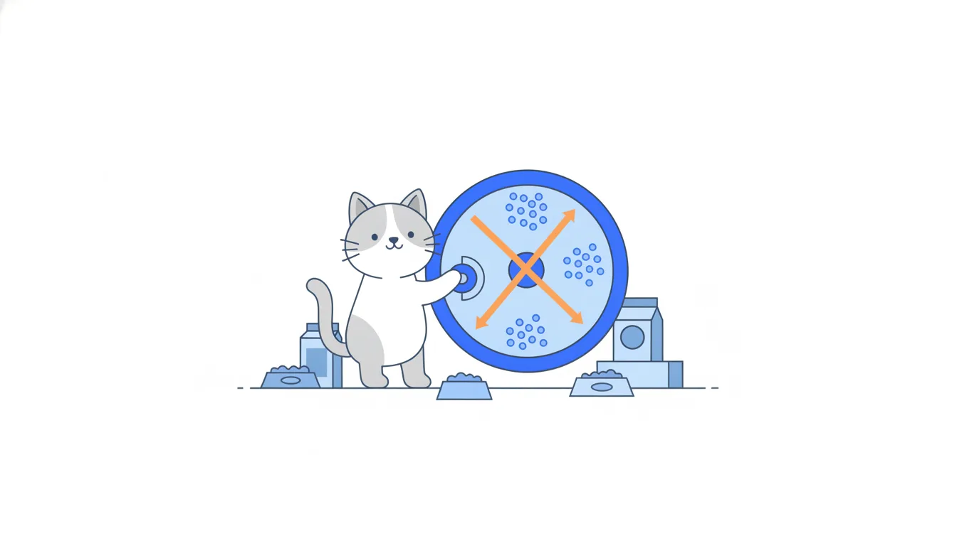
- Orthogonal rotation keeps the factors uncorrelated with each other: tidy and easy to report.
- Oblique rotation lets the factors correlate, which is often more realistic. Loyal customers may also rate delivery a bit higher.
After rotation, name each factor from its highest-loading items. If "recommend" and "trust the brand" load heavily on Factor 1 and "delivery speed" and "packaging" on Factor 2, Factor 1 is about attachment to the brand, "brand loyalty", and Factor 2 about operations.
Naming is the one step that isn't purely mechanical, but it isn't free invention either. Three rules keep it honest:
- the name must describe what the top items share;
- don't name a factor after something none of its items measure;
- if the top items share nothing obvious, say so: the factor may be noise.
- Do“Recommend” + “trust the brand” load on Factor 1 → name it “brand loyalty”.
- Don'tCalling Factor 1 “price sensitivity” when no item asks about price.
A name must come from the items, not from a hunch.
Factors as fixers for other analyses
Factor analysis isn't only for surveys. Two of its best uses repair other analyses.
- Fixing multicollinearity. Suppose a regression uses ad spend, discount depth and number of promo emails, and the three always rise together. Their coefficients are unstable. Replace them with one factor score, a single "promotion intensity" number computed from all three, and the regression has one stable predictor instead of three that fight over credit.
- Dimensionality reduction. A dataset with 40 behavioural metrics per customer is hard to cluster or model. If those metrics boil down to five factors, you can work with five columns that keep most of the information.
A close relative you'll meet in tools is principal component analysis (PCA). It builds components that capture as much total variance as possible, without assuming hidden traits behind them. For compressing data or feeding a regression, PCA and factor analysis often give similar results; for interpreting survey themes, factor analysis is the more natural fit.
The cost of a factor score is interpretability. "Promotion intensity rose by 1" is less concrete than "ad spend rose by $100", so explain what goes into the score.
- DoAd spend, discount and promo emails → one “promotion intensity” factor score in the regression.
- Don'tKeeping all three correlated predictors and reading each coefficient separately.
Their individual coefficients are unstable.
The recipe, step by step
Every factor analysis follows the same five steps, and each one needs the result of the one before.
- Compute the correlation matrix of all items. Everything else is built from these correlations.
- Extract candidate factors from the correlations. At this stage there can be as many factors as items.
- Rotate the factors (orthogonal or oblique) so each item loads clearly on one factor.
- Drop weak factors, using the Kaiser criterion (eigenvalue ≥ 1) and the scree plot's elbow.
- Name the survivors from their highest-loading items.
Chart: Correlations between four survey items · shown above
Chart: Scree plot: four factors, four eigenvalues · shown above
The order isn't arbitrary. You can't extract factors before you have correlations to extract them from. Naming before rotating means naming blurry factors, and the names often change once the picture sharpens. Naming before dropping wastes effort on factors that are noise.
Before step 1, check the inputs: enough respondents (a common rough guide is several per item, and at least a hundred or two overall), and items on comparable scales, such as a Likert scale from 1 to 5. Factor analysis can only find structure that the questions themselves contain.
- DoCorrelations → extract → rotate → drop weak → name.
- Don'tNaming all extracted factors first, then rotating and dropping some.
Names blurry factors and wastes work on noise.
Good and bad reasons to run it
Factor analysis is worth running when you want to summarise structure in a set of correlated measures. The legitimate reasons:
- turn many items into a few themes. Twenty NPS follow-up questions become three or four factors the board can actually discuss;
- shrink a wide table (dimensionality reduction) while keeping most of the information, before clustering or modelling;
- remove multicollinearity by feeding factor scores rather than many correlated items into a regression.
What it can't do:
- make respondents agree or remove disagreement. It describes how answers move together; it doesn't change them;
- prove what causes satisfaction. Factors are patterns of correlation, so a "delivery" factor isn't evidence that improving delivery will raise NPS. That needs an experiment;
- find themes the survey never asked about. If no question touches price, no price factor can appear.
In a board summary, report each factor with its name, its top items, and the share of variance it explains, rather than 20 separate averages that repeat the same few attitudes.
- Do“Two factors, brand loyalty and operations, explain 85% of the variance in the four items.”
- Don't“Factor analysis showed delivery drives NPS, so faster delivery will raise it.”
Factors describe correlations, not causes.
Ready to practise?
Answer the lesson's exercises and earn 250 points the first time you finish it.
Start the exercises