

Theory
Types of charts: choosing the right one
The main types of charts (histograms, box plots, bar, pie, scatter and line charts): which question each one answers, how bin width and axes change the story, and the classic ways charts mislead.
~11 min read · 11 exercises · 250 points
Before you start
A number for the slide
Sooner or later everyone on CatChow's product team has to put a number on a slide, and this week it's your turn. The data is ready, but the chart menu offers a dozen options, and the wrong one can make a clear finding confusing or even misleading.
In this lesson you'll match the main chart types to the question each one answers, see how bin width and axes change the story, and learn to spot charts that mislead.
Five questions, five charts
A good chart answers one question at a glance. Before you open the chart menu, write the question down; the type usually follows from it. Nearly every product and marketing chart answers one of five questions:
- How is one metric distributed? Histogram, or a box plot to compare groups.
- How do categories compare? Bar chart, sorted by value.
- What share of the whole does each part have? A bar chart; a pie only for two to four parts.
- Are two metrics related? Scatter plot, one dot per observation.
- How does a metric change over time? Line chart, time from left to right.
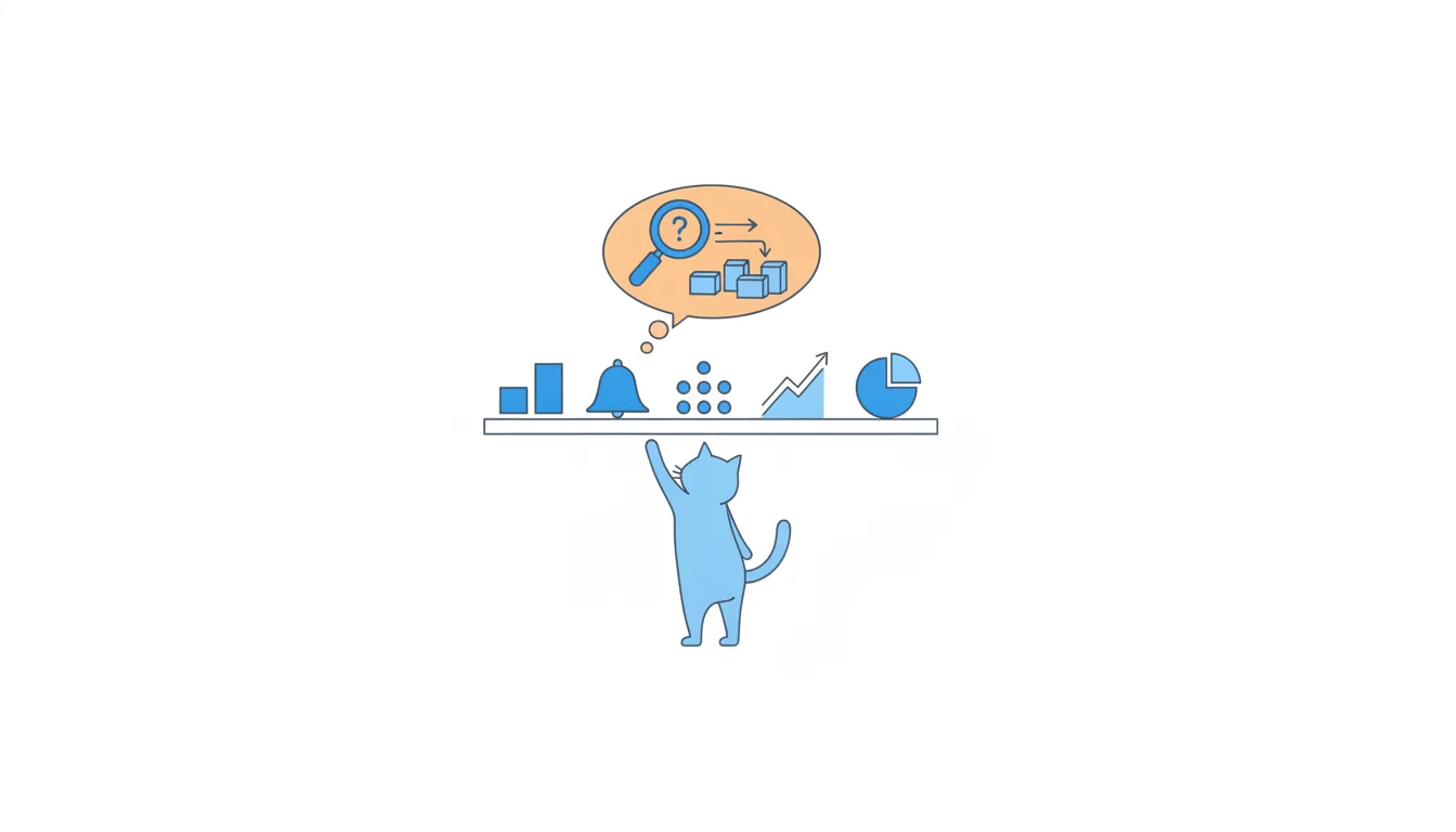
The hard part is noticing which question you're actually asking. "Do campaigns with a higher CTR get more sign-ups?" sounds like a comparison but is about a relationship, so it needs a scatter plot. "Which support topic is most common?" compares categories, so a bar chart. If you can't name the question, the chart will make the reader guess it.
Chart data
| Sessions per week | Orders |
|---|---|
| 4,000 | 84 |
| 2,500 | 40 |
| 1,800 | 54 |
| 800 | 48 |
| 400 | 11 |
Show 15 more rows
| 4,300 | 90 |
| 2,600 | 42 |
| 1,900 | 57 |
| 900 | 54 |
| 420 | 11 |
| 4,100 | 86 |
| 2,700 | 46 |
| 1,850 | 55 |
| 850 | 51 |
| 380 | 10 |
| 4,500 | 92 |
| 2,700 | 44 |
| 1,950 | 58 |
| 950 | 57 |
| 400 | 10 |
- Do“Do higher-CTR campaigns get more sign-ups?” → scatter plot, CTR vs sign-ups.
Two metrics, one relationship.
- Don't“How did daily revenue change this quarter?” → bar chart of 90 days sorted by value.
Sorting destroys the time order the question is about.
Box plots: five numbers in one picture
A box plot (box-and-whisker plot) squeezes a distribution into five numbers plus outliers:
- the box runs from Q1 to Q3, so it holds the middle 50% of values;
- the line inside is the median;
- the whiskers reach the smallest and largest values inside the IQR fences;
- dots beyond the whiskers are the outliers.
For CatChow's 90-day spend: whiskers at $12 and $93, box from $24 to $56, median $35, dots at $110 and $240. A median near the bottom of the box and a long upper whisker signal right skew.
Box plots are at their best side by side. Take CatChow's two couriers, both with a mean delivery time of 24 hours: courier A would be a thin sliver from 23 to 26 hours; courier B a tall box from 18 to 30 with whiskers from 14 to 38. One glance shows that the same mean hides very different reliability.
The limit: five numbers can't show two peaks. With small samples, also show the individual points or add a histogram.
- DoThree box plots of delivery hours, one per courier, on one shared axis.
Medians, spread and outliers compared at a glance.
- Don'tThree bars showing each courier's mean delivery time.
Equal means, equal bars: the reliability gap disappears.
Why bar axes start at zero
A bar chart asks the eye to compare lengths. That only works if the lengths are proportional to the values, which means the value axis must start at zero.
Cut the axis and the picture lies. With an axis starting at 80, a bar for 90 is 10 units long and a bar for 85 is 5 units long, so 90 looks twice as big as 85. The real difference is 90 / 85 ≈ 1.06, about 6%.
If a small difference matters, there are honest ways to show it:
- label the exact values on the bars;
- plot the difference itself (for example, +5 points against last month);
- use dots instead of bars, which don't promise anything about length.
Line charts are different. Their message is the slope, not the length, so a non-zero start can be fine, as long as the axis is clearly labelled and the change is meaningful at its real size. For bars, there are no exceptions: a truncated axis turns a small difference into a dramatic one.
- DoBars from 0 with labels “85” and “90”, plus a note: “+5 points (+6%)”.
Honest lengths, the difference stated in words.
- Don'tBars on an axis from 80, so 90 looks twice as tall as 85.
A 6% difference drawn as 100%.
Share of the whole: compute it from the totals
A "share" chart needs correct shares underneath, and the safest way to get them is from raw totals.
- Add up the part over the whole period: email brought 48 + 54 + 51 + 57 = 210 orders in four weeks.
- Add up the whole: 1,000 orders from all channels.
- Divide: 210 / 1,000 = 21%.
The classic slip is averaging weekly shares. If the weeks differ in size, the plain average of weekly percentages is a mean of averages and gives the small weeks too much say. Summing first avoids that.
The interesting part comes when you put two shares side by side. Email has 3,500 of 40,000 sessions, only 8.75% of traffic, but 21% of orders. Its conversion is 210 / 3,500 = 6%, against 1.64% for paid social (172 orders from 10,500 sessions). A chart showing share of sessions next to share of orders answers "which channel brings more than its traffic suggests?" in one look, which a chart of either share alone can't do.
Chart data
| Channel | Share of sessions, % | Share of orders, % |
|---|---|---|
| SEO | 42.25 | 35.2 |
| Google Ads | 18.75 | 22.4 |
| 8.75 | 21 | |
| Meta Ads | 26.25 | 17.2 |
| Referral | 4 | 4.2 |
- Do(48 + 54 + 51 + 57) / 1,000 = 210 / 1,000 = 21%
Sum the part, sum the whole, then divide.
- Don't210 / 3,500 = 6% reported as “email's share of orders”.
That's email's conversion rate, a different question.
Frequency tables and histograms
To see the shape of one metric, build a frequency table: split the range into equal bins and count the values in each.
- The count is the absolute frequency.
- The count divided by the total is the relative frequency, a share.
Decide the edges before you count. With $25 bins, "25–49" means from $25 up to but not including $50; a value of exactly $50 belongs to the next bin. For CatChow's 24 customers that bin holds 26, 28, 30, 32, 34, 36, 38, 42 and 45: 9 customers. In a spreadsheet, COUNTIFS with ">=25" and "<50" does it.
A histogram draws the table as touching bars, because the bins are consecutive ranges of one continuous number. That's the difference from a bar chart, whose bars stand apart because they're separate categories.
Bin width changes the story. Too wide, and the shape collapses into one or two bars; too narrow, and you see mostly noise. Start with 5–15 bins and try a couple of widths before choosing.
Chart data
| Spend in 90 days, USD | Customers |
|---|---|
| 0–49 | 16 |
| 50–99 | 6 |
| 100–149 | 1 |
| 150–199 | 0 |
| 200–249 | 1 |
- Do25 ≤ value < 50 → 26, 28, 30, 32, 34, 36, 38, 42, 45 → 9
Half-open bins: each value lands in exactly one.
- Don'tCounting $50 in both “25–49” and “50–74”.
Overlapping edges count one customer twice.
How charts mislead
Charts feel objective, which makes them powerful tools for persuasion, honest or not. The tricks you'll meet most often:
- A truncated axis: bars that don't start at zero exaggerate small differences.
- Percentages without the base: "80% loved it" from 5 people asked. Always show n.
- A cherry-picked window: start right after a bad week and any trend looks like growth.
- A drowned series: a small metric on the same axis as a big one, so its doubling disappears.
- Stretched or squeezed axes: the same data looks dramatic on a tall, narrow chart and flat on a wide one.
- Dual axes: two scales can make any two lines cross or move together. Use two charts.
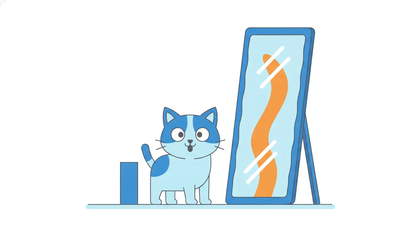
Not everything unusual is a trick. Sorting bars, labelling values directly and using one highlight colour are good practices: they make the message easier to check, not harder.
A useful test: would the reader reach the same conclusion if they saw the raw numbers? If not, the chart is doing the persuading.
- Do“4 of 5 vets asked (80%) recommend it.”
The base is visible next to the percentage.
- Don'tTwo lines on two y-axes, scaled so revenue and ad spend move in lockstep.
The scales, not the data, create the pattern.
Titles that state the answer
A chart title can do two jobs: describe what's drawn, or say what it means. On a slide, the second is almost always better.
"Orders by channel" is a descriptive title: accurate, but it leaves the reader to find the point. "Email brings 9% of sessions but 21% of orders" is a takeaway title: it states the finding in one sentence, and the chart becomes the evidence.
Chart: Email brings 9% of sessions but 21% of orders · shown above
Takeaway titles help in three ways:
- busy readers who only glance at titles still get the message;
- writing one forces you to check that the chart really shows it. If you can't write the sentence, the chart isn't ready;
- it keeps one chart to one question.
Keep it honest. The title must match what the data supports: "Email converts best" is fine; "Email will double our sales" is a forecast the chart can't back. Put caveats such as the time window, the sample size or missing cost data in a short note under the chart, not in the title.
- Do“Weekly orders grew about 10% in four weeks”
One sentence, one finding, backed by the chart.
- Don't“Email is our best channel and will double sales next quarter”
Claims a forecast the chart can't support.
Measuring the distortion of a cut axis
You can put a number on how much a truncated axis exaggerates. On any chart, the eye reads the height above the axis, not the value.
- Subtract the axis start from each value: 237 − 230 = 7 and 261 − 230 = 31.
- Compare the heights: 31 / 7 ≈ 4.43. The line looks as if it more than quadrupled.
- Compare the real values: 261 / 237 ≈ 1.10, a 10% rise.
Chart data
| Week starting | Orders, all channels |
|---|---|
| 2026-08-31 | 237 |
| 2026-09-07 | 254 |
| 2026-09-14 | 248 |
| 2026-09-21 | 261 |
The closer the axis start sits to the data, the bigger the exaggeration. Start at 0 and the visual ratio equals the real one.
For line charts, a non-zero start is sometimes acceptable, because the reader looks at the slope and the labels. Even then, check the visual ratio: if a 10% change looks like 343% growth, either start at zero or show the change itself, for example a line of week-over-week growth in percent.
When you review someone else's slide, read the axis labels first. A dramatic line next to a small label range is the most common sign that the axis has been cut.
- Do(261 − 230) / (237 − 230) = 31 / 7 ≈ 4.43, while 261 / 237 ≈ 1.10
Visual ratio vs real ratio.
- Don't261 / 237 ≈ 1.10 → “the chart shows 10%, so it's fine.”
The values say 10%; the cut axis draws more than 4×.
When a pie chart works, and when it doesn't
A pie chart shows how one whole splits into parts. People compare angles and areas much less accurately than lengths, so a pie only works in a narrow case:
- the parts really add up to one whole (100%);
- there are two to four parts;
- one part clearly dominates, as in "62% of orders come from mobile".
Outside that case it fails. With seven or nine slices, 17% and 21% look the same and nobody can put them in order. Rates such as conversion by channel aren't parts of a whole at all: they don't add up to 100%, so a pie of them is meaningless. Anything over time loses its order in a circle. And a 3D pie tilts the slices, so the front ones look bigger than they are.
For most share questions, a sorted bar chart is simply better: lengths are easy to compare and the ranking is visible. If you need to show both the parts and the total, a single stacked bar also works.
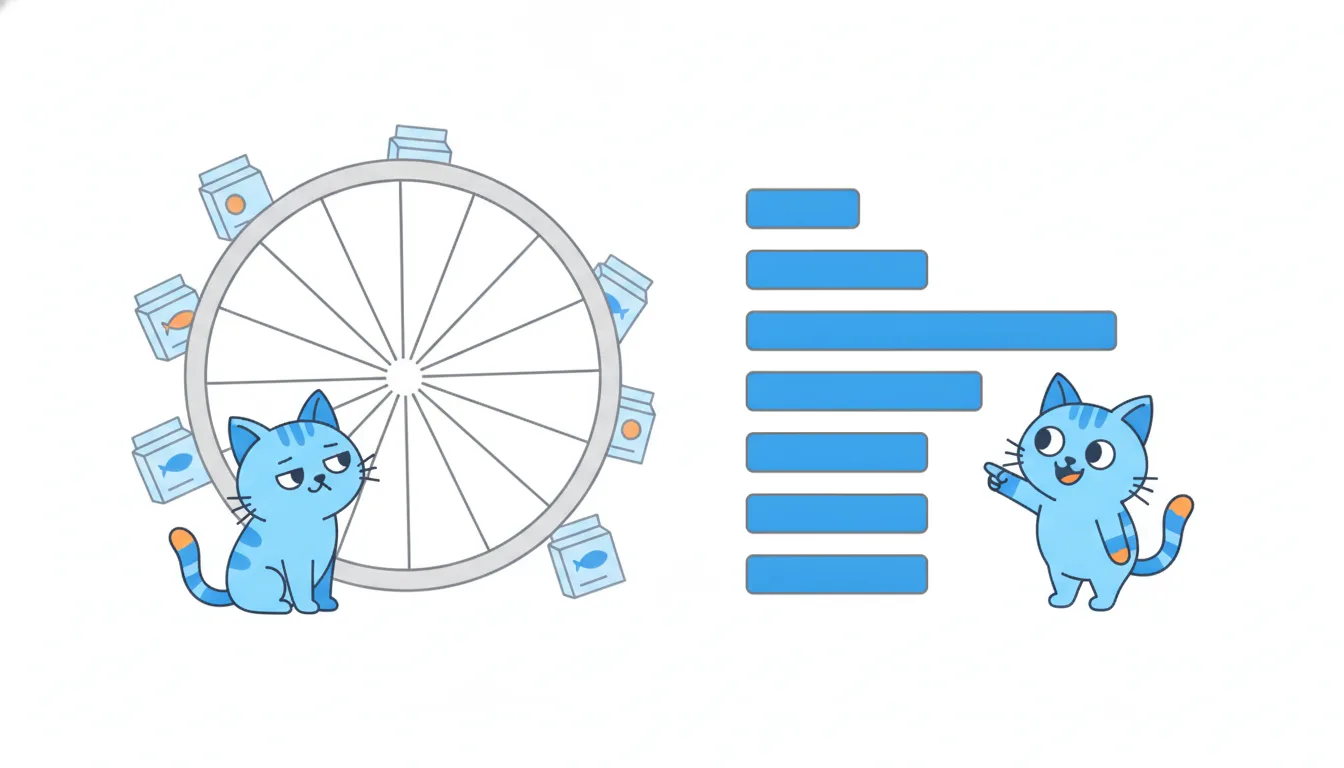
- DoTwo slices: mobile 62%, desktop 38%.
Few parts of one whole, one clearly bigger.
- Don'tA pie of five channels' conversion rates: 6%, 3%, 2.6%, 2.1%, 1.6%.
Rates aren't slices of a whole; the “pie” adds up to 15.3%.
Ready to practise?
Answer the lesson's exercises and earn 250 points the first time you finish it.
Start the exercises