

Theory
How to calculate ARPU and ARPPU
How to calculate ARPU and ARPPU, conversion to paid and trial-to-paid, and how a change in the paywall trigger mix fakes a better paywall.
~10 min read · 9 exercises · 250 points
Before you start
Are we making money on it?
You work in the product team at Halves, a bill-splitting app for flatmates, couples and trips. The app is free; a paid plan, Halves Plus, adds receipt scanning, recurring bills and other extras.
This module asks whether Halves makes money on it: what users bring in, what a user is worth over time, what buying users costs and how to read a price test. This first lesson starts with the revenue ratios everyone quotes, ARPU and ARPPU, and the denominators and traps behind them.
ARPU and ARPPU: one revenue, two denominators
Both metrics start from the same number, the month's subscription revenue, and divide it by a different group of people.
- ARPU (average revenue per user) = revenue ÷ all active users, paying or not. It answers "what does an average user of the app bring in?"
- ARPPU (average revenue per paying user) = revenue ÷ paying users only. It answers "what does an average subscriber bring in?"
At Halves in June 2026: $18,073.25 of revenue, 34,365 active users and 3,730 paying users. ARPU = $0.53, ARPPU = $4.85. The same money looks nine times bigger depending on who is in the denominator.

Two habits keep these numbers honest. First, write the denominator into the definition: who counts as active (opened the app in the month, staff excluded) and who counts as paying (had an active paid subscription in the month). Second, never put ARPU from one report next to ARPPU from another: a "drop" from $4.85 to $0.53 is just a change of denominator.
- DoARPPU, June 2026 = $18,073.25 ÷ 3,730 paying users = $4.85.
- Don'tARPPU, June 2026 = $18,073.25 ÷ 34,365 users = $0.53.
That is ARPU: the denominator includes everyone who doesn’t pay.
Why ARPU can fall while every payer pays more
ARPU splits into two factors:
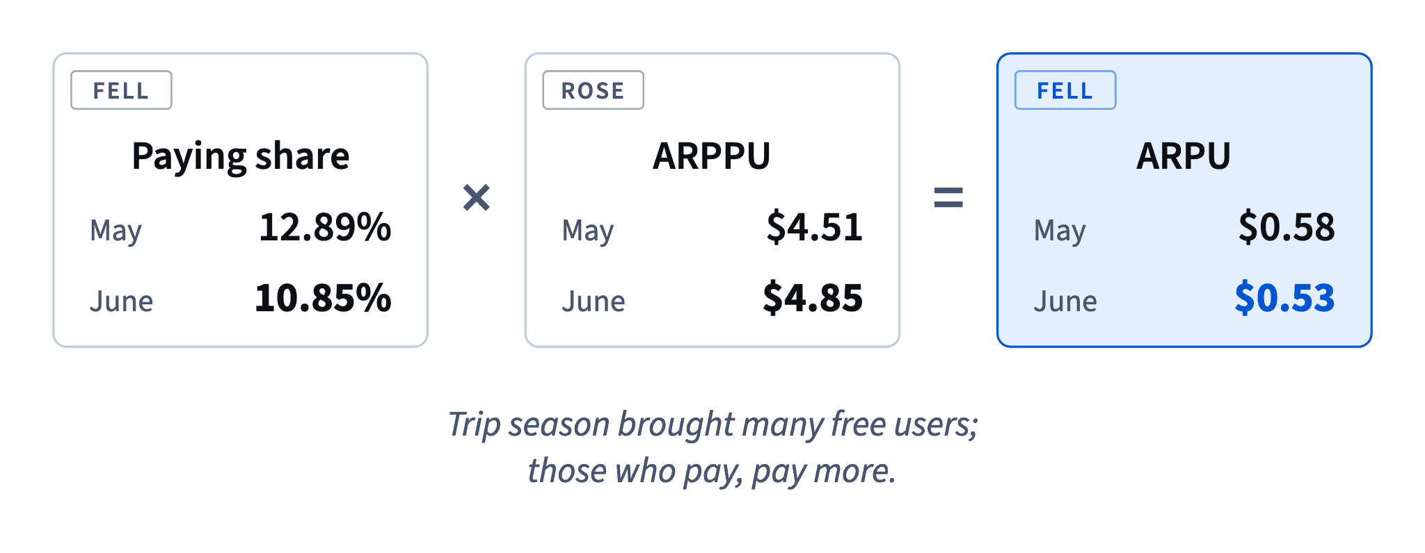
ARPU = paying share × ARPPU, where paying share = paying users ÷ active users.
So ARPU moves for two very different reasons. Either payers pay more or less (ARPPU), or the share of active users who pay changes. The second reason often has nothing to do with money: a wave of new free users lowers the share without anyone paying less.

Halves, May → June 2026: the paying share fell from 12.89% to 10.85% because trip season brought many one-off users, while ARPPU rose from $4.51 to $4.85 thanks to the April price rise. ARPU went from $0.58 to $0.53, and revenue still grew 21%.
When ARPU moves, split it before you explain it. Check the two factors and the raw counts behind them: active users, paying users, revenue. Only then name a cause. A design change on the paywall can't be blamed for a drop that comes from who opened the app this month.
- Do“ARPU fell because the paying share fell from 12.89% to 10.85%; ARPPU actually rose to $4.85.”
- Don't“ARPU fell, so subscribers are paying less.”
ARPU alone can’t tell you what payers do.
Every revenue ratio: say who is in the denominator
Most arguments about revenue metrics are arguments about denominators. Four common ratios at Halves, each with its own base:
- ARPU: revenue ÷ all active users in the month.
- ARPPU: revenue ÷ users who paid in the month.
- Conversion to paid: users who made a first payment ÷ a group you name, for example everyone who saw the paywall in April. Without the group, "our conversion is 6%" means nothing.
- Paywall-to-trial: trials started ÷ paywall viewers.
- Trial-to-paid: trials that turned into a first payment ÷ trials that have ended.
Write the denominator into the metric's name or footnote every time: "conversion to paid, of April paywall viewers: 6.27%" (373 of 5,945). The same 373 first payments give 46.86% if you divide by April's 796 trials, a completely different metric.
A useful habit: before comparing two numbers, read both denominators aloud. If they differ, you are not comparing the same thing.
- Do“Conversion to paid of April paywall viewers: 373 of 5,945 = 6.27%.”
- Don't“Our conversion is 47%.”
No denominator: it’s trial-to-paid, but a reader will take it for something else.
Billed revenue isn't monthly value
Revenue billed in a month and the value subscriptions bring in each month are different numbers whenever some plans are paid upfront. Halves' revenue column is billed revenue: every yearly plan bought or renewed in a month counts in full, $39.99 (or $29.99 at the old price) in one go.
Dataset · 6 rows
Halves Plus by month, January–June 2026
Active users, paying users, first payments and revenue per calendar month.
First 5 of 6 rows
So billed revenue swings with how many yearly plans happen to fall in a month. A month with many yearly sign-ups or renewals looks rich; those subscribers then bring nothing billed for the next 11 months. June's $18,073.25 is what Halves billed in June, not what it earns every month.
For a steady monthly picture, spread each yearly plan over its 12 months and add the monthly plans as they are. That recurring-revenue view is often called MRR (monthly recurring revenue).
Neither number is wrong; they answer different questions. Billed revenue is the cash that came in; the monthly view shows the run rate. Say which revenue a ratio such as ARPU uses, and never compare one month's billed revenue with another month's monthly value.
- Do“June: $18,073 billed (yearly plans counted in full when paid).”
- Don't“We make $18k a month.”
Billed revenue includes yearly plans paid upfront; it isn't a monthly run rate.
Trial-to-paid: count only trials that have ended
Trial-to-paid conversion = trials that turned into a first payment ÷ trials that have ended.
The word "ended" matters. A Halves trial lasts 7 days. On 30 June, the data cut, every trial started in the last week of June is still running: it hasn't converted, but it hasn't failed either. If you divide by all trials started, those open trials sit in the denominator as if they were failures, and the rate drops for no real reason. It's the right censoring described in Reading a funnel: right censoring and date ranges: the outcome hasn't happened yet when the data stops.
Dataset · 12 rows
Paywall viewers and trials by trigger, April–June 2026
Data cut: 30 June 2026. Every user is counted once per month, under the trigger of their first paywall view.
First 5 of 12 rows
June 2026, all triggers: 1,157 trials started, 887 ended, 397 converted. Correct: 397 ÷ 887 = 44.76%, close to May's 45.56%. Wrong: 397 ÷ 1,157 = 34.31%, a false alarm.
Two ways to stay safe: divide by ended trials, or report trials by start week and only for weeks whose trials have all finished. Either way, state the data cut date next to the number.
- DoJune trial-to-paid = 397 converted ÷ 887 ended = 44.76% (data to 30 June).
- Don'tJune trial-to-paid = 397 ÷ 1,157 started = 34.31%.
270 trials were still running; they are not failures.
Reporting a young month without a false alarm
The last weeks before a data cut always look worse on any metric that needs time to happen: trials that convert after 7 days, payments that come after an invoice, renewals at the end of a month. The fix isn't to wait for the month to close and say nothing; it is to report the part that has had time to finish, and to say so.
A good status line has three parts:
- the rate on the finished part ("397 of 887 ended trials converted: 44.8%");
- a comparison with the same measure in a past month ("May: 45.6%");
- what is still open ("270 June trials were still running on 30 June").
A bad status line takes the whole month's starts as the base, finds a big drop and invents a cause for it. Before raising an alarm about the latest period, always ask: has everyone in the denominator had a full chance to do the thing I'm counting?
- Do“44.8% of June trials that have ended converted, in line with May (45.6%); 270 are still open.”
- Don't“Trial conversion collapsed to 34% in June, the new paywall is scaring people off.”
A censored number plus an invented cause.
Mix shift: the total moves, the parts don’t
A paywall's overall rate can rise while every trigger converts the same or worse. It's the mix shift that Volume, quality and Simpson's paradox describes: the total moves because the weights of its parts moved, not their rates.
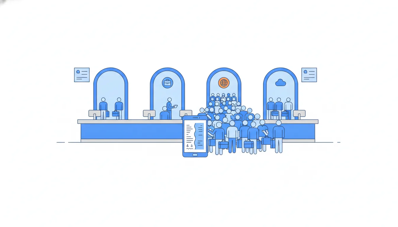
At Halves the paywall opens from four triggers: receipt scan, currency, charts and settings. They convert to a trial at very different rates: about 25% for currency, about 5% for settings. From April to June 2026 the overall paywall-to-trial rate rose from 13.39% to 16.79%. But inside each trigger the rate was flat or a bit lower (receipt scan 16.01% → 15.02%, currency 25.96% → 25.00%). What changed is who arrived: the currency trigger grew from 11.79% to 39.35% of viewers, because trip season sends people abroad.
The reverse happens too: every trigger improves and the total falls, when the mix moves toward a weak one (say, a promo that brings low-intent users).
The habit: when an overall rate moves, break it down by segment before crediting any change. Compare rates within each segment, then look at each segment's share.
- Do“Paywall-to-trial rose to 16.8%, but per trigger it was flat or lower; the currency trigger’s share tripled.”
- Don't“Paywall-to-trial rose from 13.4% to 16.8% after the redesign, so the redesign works.”
Credits the design for a change in who saw the paywall.
Hold the mix still: a mix-adjusted rate
Holding the mix still answers a fair question: would June convert better with April's visitors? As in Volume, quality and Simpson's paradox, weight each June trigger rate by April's share of that trigger:
rate at April mix = Σ (April share of each trigger × June rate of that trigger)
April shares: receipt scan 44.54%, currency 11.79%, charts 25.38%, settings 18.28%. June rates: 15.02%, 25.00%, 8.51% and 5.00%. So 0.4454 × 0.1502 + 0.1179 × 0.2500 + 0.2538 × 0.0851 + 0.1828 × 0.0500 = 12.71%, below April's actual 13.39%: with the same visitors, June converts no better than April. Keep four decimals until the end.
The adjustment removes one explanation; it doesn't prove a cause. To know whether the design helped, run an A/B test.
How it fits together: every revenue number needs its denominator, the right revenue (billed or monthly), only outcomes that have had time to happen and a stable mix before it means anything. Next, The LTV curve: what a user is worth over time.
- DoApril shares × June rates: 0.4454 × 0.1502 + 0.1179 × 0.25 + 0.2538 × 0.0851 + 0.1828 × 0.05 = 12.71%.
- Don'tAveraging the four June rates: (15.02 + 25.00 + 8.51 + 5.00) ÷ 4 = 13.38%.
A plain average ignores how many viewers each trigger had.
Ready to practise?
Answer the lesson's exercises and earn 250 points the first time you finish it.
Start the exercises