

Theory
Selection bias: users who do X retain better
A selection bias example: correlation, self-selection, a confounding variable and what a feature's users can and can't tell you.
~10 min read · 9 exercises · 250 points
Before you start
Scanners stay longer?
Maya has spotted a promising pattern in Halves data for the Plus pitch: new users who scan a receipt in their first week are far more likely to be active in week 4. She wants to push scanning in onboarding, and Theo wants it on the store page. First it comes to you.
In this lesson you'll learn when "users who do X retain better" is a correlation and when it's a cause, and what a feature's own users can and can't tell you.
Correlation is a description, cause is a claim
"Users who do X retain better" is one of the most common slides in product analytics, and one of the most often misread.
Maya's numbers are right: new users who scanned a receipt in their first week were active in week 4 at 49%, everyone else at 27%. That's a correlation: two things that go together in the data. It describes what happened.
"Scanning makes people stay" is a different kind of statement: a claim about cause. It predicts what would happen if you changed something, for example pushed more people to scan. The data on who happened to scan can't show that on its own, because the scanners might differ from everyone else in ways that also drive retention.

A practical test is the verb. Descriptive verbs ("were active", "retained better", "are more likely to") stay with the data. Causal verbs ("boosts", "drives", "makes", "lifts") need evidence that the change itself produced the difference, which usually means an experiment.
Keep the numbers; drop the arrow from one to the other until something has earned it.
- Do"New users who scanned in week 1 were active in week 4 at 49%, others at 27%."
- Don't"Scanning receipts boosts retention by 22 points."
A causal verb on a correlation.
Recomputing the headline gap
Before questioning a claim, check that its numbers are right. The dataset splits new users (April–May sign-ups who added at least one expense in days 0–6) by how busy they were in week 1 and whether they scanned a receipt.
Dataset · 6 rows
Receipt scanning and week-4 retention
New Halves users from April–May 2026 who added at least one expense in days 0–6.
First 5 of 6 rows
Pool each group across the activity buckets, then divide once:
- Scanners: active 9 + 49 + 184 = 242 of 57 + 133 + 303 = 493 users, so 242 ÷ 493 = 49.09%.
- Non-scanners: 173 + 335 + 233 = 741 of 1,343 + 967 + 397 = 2,707, so 741 ÷ 2,707 = 27.37%.
- Gap: 49.09 − 27.37 = 21.71 pp, computed from the unrounded rates.
So Maya's 49% against 27% holds. The problem is never the arithmetic; it's what the gap is taken to mean.
Two details are worth noticing on the way. Scanners are a small group: 493 of 3,200 users, about 15%. And the rows already hint at the next step: the scanners' users are concentrated in the busiest bucket. A pooled total hides that composition; the rows show it.
- Do242 ÷ 493 − 741 ÷ 2,707 = 49.09% − 27.37% = 21.71 pp
- Don'tAveraging the three bucket rates for each group
Buckets have very different sizes; pool the counts instead.
Self-selection: look at who is in each group
Nobody assigned users to scan. They chose to, and the people who choose a feature are rarely a random slice of everyone.
Who scans receipts in Halves? Free users get three scans a month, and you scan when you're the one paying for dinners and groceries. So scanners tend to be the busy ones. The rows confirm it: 303 of 493 scanners (61.46%) added five or more expenses in week 1, against 397 of 2,707 non-scanners (14.67%).

Dataset: Receipt scanning and week-4 retention · shown above
And busy users retain better whatever they do with receipts: in the 5_plus bucket about 59–61% were active in week 4, in the 1 bucket only about 13–16%.
That's selection bias, here self-selection: the two groups differ because of who ended up in each, not only because of the feature. The 22-point gap compares a group made mostly of heavy users with a group made mostly of light ones.
The habit to build: whenever a slide compares "users who did X" with "users who didn't", ask first how the two groups differ before X. If they differ in something that also drives the outcome, the raw gap mixes the two.
- DoScanners in
5_plus: 303 ÷ 493 = 61.46%; non-scanners: 397 ÷ 2,707 = 14.67% - Don't"Scanners and non-scanners are the same people; one group just scanned."
They chose to scan, and the choosers are the busy ones.
A confounding variable, and comparing within it
Week-1 activity is a confounding variable: it drives both the "cause" (busy users scan more) and the outcome (busy users retain better). A confounder can create a gap between two groups even if the feature itself does nothing.
The first fix is to compare within the confounder: scanners against non-scanners who were equally busy.
5_plus: 184 ÷ 303 = 60.73% against 233 ÷ 397 = 58.69%, +2.04 pp;2_to_4: 36.84% against 34.64%, +2.20 pp;1: 15.79% against 12.88%, +2.91 pp.
Dataset: Receipt scanning and week-4 retention · shown above
Two to three points in every bucket, not 22. Most of the headline gap was the confounder.
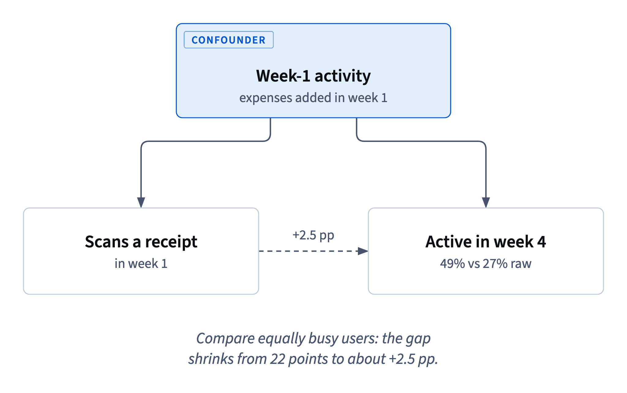
This is the core logic of stratifying: if a feature mattered a lot, its gap would survive inside groups of similar users. When the gap collapses, the original comparison was mostly about who the users were.
Two limits remain. The buckets are coarse, so some activity difference is still inside each one. And you can only stratify by what you measured: anything else that differs between scanners and the rest stays in the remaining two or three points.
- Do
5_plus: 60.73% − 58.69% = +2.04 pp - Don't
5_plusscanners (60.73%) vs all non-scanners (27.37%)Compares heavy users with everyone: the confounder is back.
How much of the gap is mix? Adjust both ways
Re-weighting, the same tool Traffic mix and seasonality uses for a mix shift, also measures how much of a gap a confounder explains: give one group the other's mix of buckets and keep its own rates. That turns three within-bucket gaps into one number.
Scanners at the non-scanners' mix. Non-scanners are 49.61% in 1, 35.72% in 2_to_4 and 14.67% in 5_plus. Apply the scanners' rates: 0.4961 × 15.79 + 0.3572 × 36.84 + 0.1467 × 60.73 ≈ 29.9%, against the non-scanners' 27.4%: about +2.5 pp.
Non-scanners at the scanners' mix. Scanners are 11.56%, 26.98% and 61.46%. Apply the non-scanners' rates: 0.1156 × 12.88 + 0.2698 × 34.64 + 0.6146 × 58.69 ≈ 46.9%, against the scanners' 49.1%: about +2.2 pp.
Both directions tell the same story. Give the non-scanners the scanners' activity and they jump from 27.4% to 46.9%: roughly 19.5 of the 21.7 points are explained by activity alone. The scanning-specific part is about 2–2.5 points.
The two answers differ slightly because the bucket gaps differ slightly; neither is "the" right one. Say which mix you used.
- Do0.1156 × 12.88 + 0.2698 × 34.64 + 0.6146 × 58.69 ≈ 46.9%
- Don'tWeighting by the scanners' mix but with the scanners' own rates → 49.1%
That just reproduces the scanners' rate; swap in the other group's rates.
What observational data can support
After stratifying, sort every possible claim into two piles.
Supported (descriptive):
- new users who scanned in week 1 retained better in week 4 (49% vs 27%);
- most of that gap comes from scanners being busier in week 1;
- among equally busy users, scanners retained 2–3 points better.
Dataset: Receipt scanning and week-4 retention · shown above
Not supported (causal or predictive):
- "scanning raises retention by about 22 points": most of the gap is activity;
- "if everyone scans, retention will reach 49%": that assumes the gap is caused by scanning and would transfer to people who don't currently choose to scan;
- "scanning does nothing": the remaining 2–3 points may or may not be scanning.
The remaining gap can't be pinned on scanning because the comparison was split by one thing only. Scanners may also be the group's treasurer, travel more, or be on a Plus trial. Each of those could explain a few points, and none of them is a column in the table.
So the honest summary is "scanners retain better, mostly because they're busier", plus a test for the rest.
- Do"Among equally busy users, scanners retained 2–3 points better."
- Don't"Get everyone scanning and retention reaches 49%."
A prediction about an intervention the data never saw.
The effect on everyone assigned is smaller
In a randomized test, the effect across everyone assigned is smaller than the effect on the users the change actually moves. It's the dilution that Who is in the test: triggers and cluster randomization describes: only part of the audience is affected.
A scanning prompt doesn't make everyone scan. Some users would have scanned anyway, and many ignore the prompt. If the prompt moves 20% of assigned users into scanning, and scanning truly added 2.5 pp of week-4 retention for them, the effect across everyone assigned is:
Effect on all assigned = share moved × effect on those moved = 0.20 × 2.5 = 0.5 pp
Comparing everyone assigned is what keeps the test fair, so the smaller number is the one to plan for. A test sized to detect +22 points, the slide's number, would be hopelessly small for a real effect of half a point. Plan the MDE from the realistic chain (how many users the prompt moves, times a plausible effect for them), not from the observational gap.
Comparing only the users who scanned in each variant doesn't rescue the effect; it brings the selection back.
- Do0.20 moved × 2.5 pp = 0.5 pp across everyone assigned
- Don'tSizing the prompt test for an MDE of +22 points
The observational gap is mostly selection, and the prompt moves only some users.
Test what you'd ship, compare everyone assigned
The team's real question isn't "does scanning help?" in the abstract but "would promoting scanning raise retention?" That's about something you can ship, so it can be tested.
The design:
- Randomize the shippable change, such as an onboarding prompt that suggests scanning. A coin decides who gets it, so the groups are alike in everything, measured or not.
- Compare everyone assigned, scanners or not, on week-4 retention (comparing by assignment).
- Size it for a realistic effect, much smaller than the observational gap.
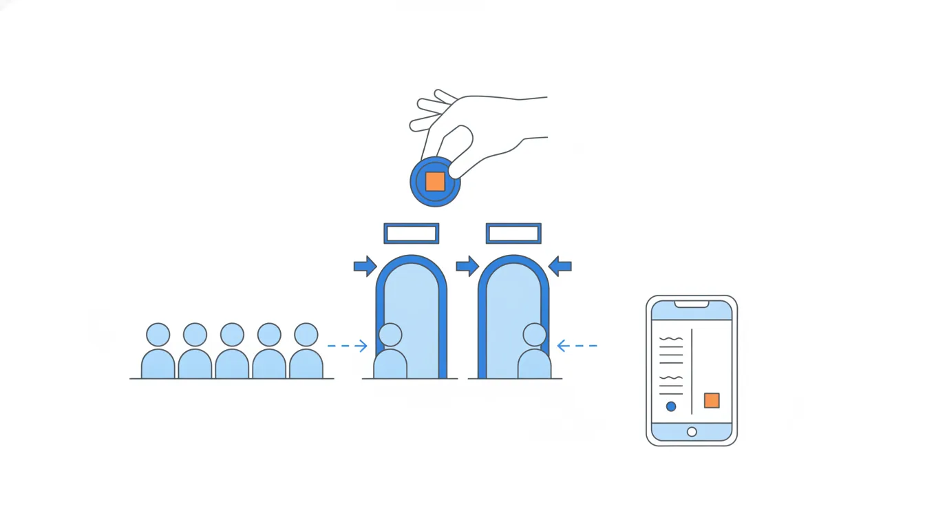
The tempting alternatives keep the bias: scanners against non-scanners over a longer period is the same self-selected comparison; a before/after mixes the prompt with everything else; comparing only those who scanned in each variant lets users select themselves again.
How it fits together: describe the gap, find who chose the feature, compare within the confounder, re-weight to size it, then test the shippable change by assignment, sized for a realistic effect. Next, Case: the version or the traffic? puts these tools together.
- DoRandomize the scanning prompt; compare week-4 retention of all assigned vs all not assigned
- Don'tRandomize the prompt, then compare only users who scanned in each arm
The prompt changes who scans, so selection comes back.
Ready to practise?
Answer the lesson's exercises and earn 250 points the first time you finish it.
Start the exercises