

Theory
Case: a north star for Halves
Pick and defend a north star metric for Halves, with six months of numbers behind it.
~10 min read · 10 exercises · 250 points
Before you start
Case: a goal for the second half
Goal-setting time at Halves. Next week the board sets goals for July to December. The CEO wants monthly active users as the company goal, Theo wants sign-ups, and Maya needs a recommendation from you, backed by numbers.
This case closes the module. You'll put the candidates side by side with six months of data, check the claims on the slides, and pick and defend a north star for Halves.
Check the growth number before using it
Goal-setting meetings run on growth rates, and a wrong one costs you the room. Recompute every headline figure from the table.
Dataset · 6 rows
Halves monthly metrics, January–June 2026
Staff accounts excluded. Paid social campaigns started in April.
First 5 of 6 rows
Growth over a period = end value ÷ start value − 1
For MAU, January to June: 15,500 ÷ 9,800 − 1 = 0.5816 ≈ 58.2%. The CEO's "58%" holds up.
Two common slips:
- dividing by the end value: (15,500 − 9,800) ÷ 15,500 ≈ 36.8%. Growth is always measured against the starting point;
- summing monthly growth rates: adding up five month-on-month changes doesn't give the total change, because each month's rate has a different base.
Then do the same for every candidate over the same months, so they're comparable: sign-ups +119.4%, MAU +58.2%, app opens +47.9%, expenses added by people +14.8%, Plus subscribers +21.5%. Laying them side by side is what reveals the pattern: the reach numbers grew fast, the value numbers slowly.
Round only at the end, and keep one decimal for percentages that will be compared.

- DoMAU growth = 15,500 ÷ 9,800 − 1 ≈ 58.2%
- Don'tMAU growth = (15,500 − 9,800) ÷ 15,500 ≈ 36.8%
Divides by the end value instead of the start.
Reach vs value: compare the growth rates
Once each candidate has its growth rate, sort them into reach and value:
- reach: sign-ups +119.4%, MAU +58.2%, app opens +47.9%;
- value: expenses added by people +14.8%, weekly active groups +11.8%.
Weekly active groups, the north star from earlier in this module, grew 1,655 ÷ 1,480 − 1 = 0.1182 ≈ 11.8%, against 58.2% for MAU. MAU grew about five times faster than the groups that actually share costs.

Absolute numbers tell the same story in a different voice: +5,700 monthly users against +175 weekly active groups. Both are true; neither is a mistake.
The gap between the two groups of numbers is the finding. Reach growing much faster than value means most of the new people aren't getting what the product is for, or aren't getting it yet. A goal set on a reach number would celebrate that gap; a goal set on the value number makes the company look at it.
Note that weekly_active_groups here is the average per week within each month, so it's comparable from month to month even though months have different lengths.
- Do“Reach: MAU +58.2%. Value: weekly active groups +11.8%. The gap is the finding.”
- Don't“Everything grew in H1, so the product is on track.”
Hides that value grew five times slower than reach.
Normalize to see what reach turned into
Growth rates compared side by side hint at a gap; a normalized ratio measures it. Divide a value number by a reach number, month by month, and watch where it goes.
- Weekly active groups per 1,000 MAU: January 1,480 ÷ 9,800 × 1,000 ≈ 151; June 1,655 ÷ 15,500 × 1,000 ≈ 107.
- Expenses added by people per MAU: January 41,200 ÷ 9,800 ≈ 4.20; June 47,300 ÷ 15,500 ≈ 3.05, down about 27%.
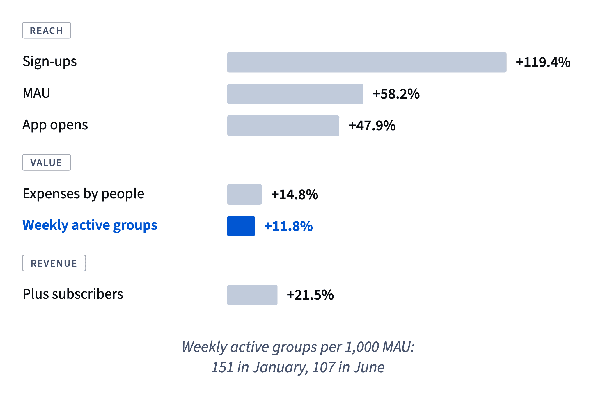
Both ratios say the same thing: for every monthly user, fewer groups share costs and fewer expenses get added. The totals still grew, so nothing is collapsing; the extra users just contribute little.
A normalized ratio is the bridge between a volume and a quality reading. It doesn't explain why, and it's sensitive to mix: if many new users joined recently, they haven't had time to form groups yet. That's why the next step is to split by sign-up cohort and channel.
Watch the units when you normalize: per user, per 1,000 users and as a percentage are all fine, but say which one you're using.
- DoExpenses per MAU: 4.20 in January → 3.05 in June (47,300 ÷ 15,500)
- Don't“Expenses grew 14.8%, so engagement is up.”
A total that grows slower than the user base means less per user.
A first hypothesis, not a verdict
Weekly active groups per 1,000 MAU fell from 151 to 107, and paid campaigns ran from April. What happened?
Weigh each story against the evidence in the table:
Dataset: Halves monthly metrics, January–June 2026 · shown above
- Broken tracking? It would show as a sudden drop in expenses. Expenses rose every month.
- The product got worse for existing groups? Possible, but active groups kept growing in absolute terms.
- Summer trips? The ratio started falling in April, before the season, and trips create groups.
- A change in who the users are? The drop starts when the campaigns do. Many campaign users may open the app but rarely end up in a group with a second active member. That's a mix shift toward users who stay solo.
The last story fits best, so it's the best first hypothesis. It is not a conclusion. Monthly totals blend campaign users with everyone else, and a product problem could produce similar totals.
To test it, split weekly active groups by sign-up cohort and channel: do campaign cohorts form groups at a lower rate than invited users who signed up in the same months? Until then, say "likely" and say how you'll check, especially when a colleague's work is involved.
- Do“Likely a mix shift toward solo campaign users; we'll confirm by cohort and channel.”
- Don't“Theo's campaigns ruined our user quality.”
States a hypothesis as a proven cause, and blames before checking.
Why each rejected candidate fails
Rejecting a candidate is easier to defend when you name its weakness in one line. Use the five checks from The north star metric and its KPI tree: (1) it can't rise while users get less value, (2) it tracks delivered value, (3) it leads revenue, (4) it splits into inputs teams can move, (5) it has a written definition. For Halves:
- MAU fails check 1: anyone who opened the app once counts, so a bigger ad budget raises it whether or not anyone splits a bill.
- New sign-ups fail checks 1 and 2: acquisition only, nothing about use, and the easiest number to buy.
- App opens fail check 1: they also rise when people struggle and check their balance again and again.
- Plus subscribers fail check 3: they are revenue and lag behind value, and a paywall in the way of sharing can lift them while groups lose, so they fail check 1 too.
Weekly active groups passes all five: two people sharing costs is the value, groups lead Plus, the tree splits them into inputs, and the definition is written.
Rejected doesn't mean deleted. Each stays on the dashboard with a role: reach, acquisition, friction signal, monetization. None of them is the company goal.
- Do“App opens stay as a friction signal: a spike with flat expenses means people are struggling.”
- Don't“We picked groups, so remove MAU and sign-ups from the dashboard.”
Rejected as a goal isn't useless as context.
A north star isn't a compromise
When people disagree about the goal, a middle option is tempting: Plus subscribers grew 21.5%, between MAU (+58.2%) and weekly active groups (+11.8%).
But a north star is chosen by what it measures, not by where its growth rate lands. Run Plus through the same five checks as every other candidate:
- Can't rise while users lose? It can: a paywall in front of features groups need lifts subscriptions for a while and hurts sharing.
- Tracks delivered value? Partly: people pay for receipt scanning once they already share lots of costs.
- Leads revenue? It is revenue, and it lags value: a group that stops sharing today cancels next month.
- Splits into inputs? Into new subscriptions and cancellations, but their levers are pricing and paywalls, not the value groups get.
- Written definition? Easy, and it doesn't fix checks 1–3.
So Plus is the right number to check monthly, next to the north star, and the wrong one to steer by. Every candidate is useful for something; the one the whole company steers by must survive the checks, not the negotiation.
- DoNorth star: weekly active groups. Monthly check alongside: Plus subscribers.
- Don't“Let's take Plus: its growth is in the middle, so nobody is upset.”
Chooses by politics, not by what the number measures.
A goal that can't be bought
The CEO's objection is predictable: "Groups grew 12%, MAU grew 58%. Why pick the goal that looks worse?"
The answer is the point of a north star: it looks worse because it can't be bought. A MAU goal of 20,000 by December can be hit by doubling the ad budget while groups stall, which is roughly what January to June already showed. A goal on weekly active groups rises only when more people actually split costs together, so hitting it means the product is working for more groups.

A well-formed goal line has three parts:
- The north star and its definition: weekly active groups, two or more members adding or settling an expense, staff excluded, average per week in the month.
- The starting point: 1,655 in June, and the target the board agrees.
- What's tracked alongside: MAU as reach, Plus subscribers as the revenue check.
That way the board doesn't lose anything it cares about. It still sees reach and revenue every month; it just stops rewarding growth that doesn't turn into groups.
- Do“Weekly active groups from 1,655 (June); MAU and Plus tracked alongside.”
- Don't“MAU to 20,000 by December.”
Reachable with ad money alone while groups stall.
Name the limit of your analysis
A recommendation is more convincing, not less, when it says what the data can't show. A limit you state up front earns trust; one the board finds on its own costs it.
A good limit line has two parts:
- What the data can't tell you, specifically. The table holds monthly totals, so it doesn't show which users came from the campaigns. The drop in groups per 1,000 MAU fits a mix shift toward campaign users, but a product problem could produce similar totals.
- The next step that would tell you. Split weekly active groups by sign-up cohort and channel, and compare campaign cohorts with invited users from the same months.
Dataset: Halves monthly metrics, January–June 2026 · shown above
A limit line is not an overclaim the other way ("the data prove the campaigns brought low-quality users"), an attack on a metric that works as designed, or doubt about a definition applied the same way every month.
How it fits together: recompute the growth numbers, sort reach from value, normalize, form a hypothesis, choose by the five checks and state the limit. This module answered which numbers to steer by; the next one asks where new users get stuck.
- Do“Monthly totals can't separate campaign users; next we split groups by cohort and channel.”
- Don't“The data prove the campaigns brought low-quality users.”
Claims more than monthly totals can show.
Ready to practise?
Answer the lesson's exercises and earn 250 points the first time you finish it.
Start the exercises