

Theory
Correlation coefficient: how two metrics move together
Measuring how two metrics move together with the correlation coefficient (Pearson and Spearman), and why that alone proves nothing about cause.
~11 min read · 11 exercises · 250 points
Before you start
More ad money, more orders?
A new module on CatChow's product team, about how metrics relate to each other. Last week you asked whether raising the ad budget actually brings in more orders. It sounds obvious, but nobody has checked it against the data.
In this lesson you'll take ten weeks of ad spend and orders, plot them, and sum up how closely the two move together in one number, the correlation coefficient, while keeping in mind what it can't prove.
Reading a scatter plot
A scatter plot is the first thing to draw when you suspect two metrics are linked. Each dot is one observation, here one week: ad spend on the x-axis, orders from ads on the y-axis.

Read it in three passes:
- direction. Do the dots climb from bottom left to top right (positive), fall (negative), or show no tilt at all?
- shape. Do they follow a rough straight band, a curve, or separate clumps?
- scatter. How tightly do they hug that band? A tight band is a strong relationship; a loose cloud is a weak one.
Real data almost never sits on a perfect line. In CatChow's ten weeks the dots clearly drift upward, yet week 4 had more spend than week 3 and fewer orders. That is normal: holidays, stock-outs and competitors add noise. A pattern is "higher spend tends to come with more orders", not "every extra dollar buys the same number of orders".
Chart data
| Ad spend, USD | Orders from ads |
|---|---|
| 200 | 20 |
| 300 | 23 |
| 350 | 30 |
| 400 | 28 |
| 450 | 36 |
Show 5 more rows
| 500 | 33 |
| 550 | 42 |
| 600 | 38 |
| 650 | 48 |
| 700 | 44 |
Draw the plot before computing anything: a single number can hide a curve or an outlier that the eye spots at once.
- Do“Weeks with more spend tend to bring more orders, with a few weeks off the trend.”
Direction, strength and the exceptions in one sentence.
- Don't“The dots go up, so every extra $100 adds the same orders.”
Reads a noisy drift as a perfect line.
Covariance: do two metrics move together?
Covariance turns the scatter plot's tilt into a number. For every week, take two deviations: how far spend is from its mean (x − x̄) and how far orders are from theirs (y − ȳ). Multiply them.
Chart: Ad spend vs orders from ads, 10 weeks · shown above
- Both above average, or both below: the product is positive.
- One above and one below: the product is negative.
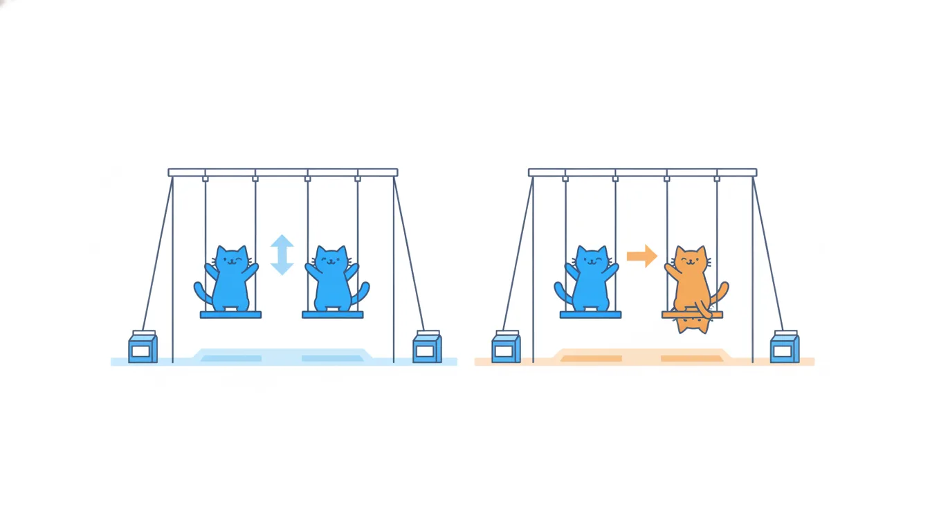
Add up the products and divide by n − 1. If the metrics rise and fall together, positive products win and the covariance is positive. If one rises while the other falls, it's negative. If they're unrelated, the products point both ways and the sum lands near zero.
For CatChow's ten weeks the sum of products is 12,460, clearly positive, so the covariance is 12,460 / 9 ≈ 1,384.
The weak spot is the units. Covariance is measured in dollars × orders, so its size depends on the scale: record spend in cents and it grows a hundredfold, though nothing real has changed. That's why covariance tells you the direction but not how strong the link is.
- DoSum of deviation products = +12,460 → spend and orders tend to move together.
- Don't“Covariance is 1,384, so the relationship is very strong.”
The size of covariance depends on units; only its sign is readable.
Pearson's r: covariance without units
The Pearson correlation coefficient fixes covariance's unit problem by dividing it by the spread of both variables:
r = Σ(x − x̄)(y − ȳ) / √[Σ(x − x̄)² × Σ(y − ȳ)²]
The dollars and the orders cancel out, and what's left is a pure number between −1 and 1:
- r = 1: every dot on a rising straight line;
- r = −1: every dot on a falling straight line;
- r = 0: no linear relationship.
Because r has no units, rescaling a variable doesn't move it. Spend in dollars, hryvnias or cents, orders counted singly or in dozens: r stays the same. Adding a constant doesn't change it either. That's what makes r comparable across metrics and teams.
Two limits to remember. r measures only straight-line relationships: a U-shaped link, where both very low and very high values go with low orders, can give r near 0. And r says nothing about the slope: r = 0.95 doesn't tell you how many orders each dollar buys. That's the job of regression in the next lesson.
- DoSpend in $ or in UAH: r ≈ 0.95 either way.
r is unit-free.
- Don't“r = 0.95, so each extra dollar brings 0.95 orders.”
r is not a slope.
Sign is direction, size is strength
Read r in two separate steps.
- The sign gives the direction. A plus means the metrics tend to rise together; a minus means one tends to fall as the other rises. A minus is not "bad" or "weak": delivery time and repeat orders going in opposite directions is exactly what you'd expect.
- The distance from zero gives the strength. Look at |r|, the value without its sign. r = −0.8 and r = 0.8 are equally strong.
A common rule of thumb for |r|:
- below 0.3: weak;
- 0.3 to 0.7: moderate;
- above 0.7: strong.
These bands are informal. In tidy product data (page views and sessions) 0.7 can be unremarkable; in noisy behavioural data (survey scores and spend) 0.4 can be a useful find. And even a strong r only describes how the two metrics move together in this data: it doesn't tell you which one, if either, drives the other.
In a sentence, state both parts: "a strong negative relationship: slower cities tend to have fewer repeat customers".
- Dor = −0.8: strong, negative.
- Don'tr = −0.8 is weaker than r = 0.3 because it is below zero.
Compares signed values instead of |r|.
Computing r by hand
On a small dataset you can compute r in five steps. Take five product pages with 1 to 5 reviews and conversion rates of 9, 8, 10, 11 and 12%.
- Means. Reviews: x̄ = 3. Conversion: ȳ = 10.
- Deviations. Reviews: −2, −1, 0, 1, 2. Conversion: −1, −2, 0, 1, 2.
- Products of deviations, then sum: 2 + 2 + 0 + 1 + 4 = 9.
- Sums of squares. Reviews: 4 + 1 + 0 + 1 + 4 = 10. Conversion: 1 + 4 + 0 + 1 + 4 = 10.
- Divide. r = 9 / √(10 × 10) = 9 / 10 = 0.9.
The denominator is the square root of the product of the two sums of squares. A frequent slip is to add them, or to forget the root: 9 / 100 = 0.09 looks like "no relationship" when the real answer is strong.
A sanity check helps: r can never be outside −1 to 1. If you get 1.4 or −2, something in steps 3–5 went wrong.
- Dor = 9 / √(10 × 10) = 0.9
- Don'tr = 9 / (10 × 10) = 0.09
Forgets the square root and turns a strong link into "none".
r on a real dataset
On real data the steps are the same; a spreadsheet just does the arithmetic. For CatChow's ten weeks:
Dataset · 10 rows
CatChow weekly ad spend and orders from ads
Ten weeks of weekly ad spend and the orders attributed to ads. Synthetic data made for this course; reused in the next lesson.
First 5 of 10 rows
- mean spend x̄ = $470, mean orders ȳ = 34.2;
- sum of deviation products = 12,460;
- sum of squared spend deviations = 231,000; sum of squared order deviations = 749.6;
- r = 12,460 / √(231,000 × 749.6) ≈ 12,460 / 13,159 ≈ 0.95.
In a spreadsheet, CORREL(spend range, orders range) returns the same 0.95.
How to report it: "a strong positive linear relationship over ten weeks". Three habits make the number honest:
- say over what. r describes these ten weeks and the $200–$700 range of spend. It says nothing about $2,000 a week;
- mention exceptions. Week 4 broke the trend; a reader looking at the plot will see it;
- remember n. Ten points is a small sample. A strong r on ten points is worth taking seriously, but one unusual week can still move it a lot.
Chart: Ad spend vs orders from ads, 10 weeks · shown above
What r doesn't say is just as important: it isn't a slope and it isn't proof that ads cause orders.
- Do“r ≈ 0.95 over ten weeks with spend of $200–$700: a strong positive link.”
- Don't“r = 0.95, so at $2,000 a week orders will keep rising the same way.”
Stretches r far beyond the range of data it came from.
Four explanations for one correlation
When two metrics move together, at least four stories can produce the same scatter plot:
- direct causation. A changes B. A controlled price test that raises prices for a random half of visitors and sees fewer orders there shows this;
- reverse causation. B changes A. Customers with long tenure give higher NPS, but maybe staying long makes people like the product more, not the other way round;
- a confounder. A third variable drives both. A flash sale brings a traffic spike that slows the site and creates refund requests; the slow site and the refunds correlate without one causing the other;
- coincidence. Over a short period, two unrelated series can line up by chance, like the office cat's naps and daily orders over one month.

The correlation coefficient is the same in all four cases, so it can't tell them apart. What helps is outside knowledge (what else changed?), timing (which came first?), more data (does it repeat?) and, best of all, a controlled experiment, where you change A yourself at random and watch B.
- Do“Load time and refunds rise together on sale days; the sale is a likely confounder.”
- Don't“Slow pages make people ask for refunds, so let's speed up the site to cut refunds.”
Picks direct causation without ruling out the shared driver.
Pearson or Spearman
Pearson's r is built from deviations from the mean, so one extreme value can dominate it. Suppose a blogger mentions CatChow in week 5 and ads get credited with 120 orders instead of 36. Pearson's r falls from 0.95 to about 0.26, though nine weeks out of ten still rise neatly with spend.
Spearman's rank correlation (ρ) is the robust alternative:
- Replace each value with its rank: 1 for the smallest, n for the largest (ties share the average rank).
- Compute Pearson's r on the ranks.
The blogger week now just becomes rank 10, however large it was, and ρ stays at about 0.78. On the clean ten weeks both coefficients give 0.95.
Spearman also measures any steady rise or fall, not only a straight line, so it suits a relationship that climbs and then flattens.
Reach for Spearman when a metric is skewed (order value, revenue per user), has outliers, or is ordinal (a 1–5 rating). Use Pearson for roughly symmetric data with a straight-line pattern. Either way, look at the odd week itself: an outlier is often the most interesting row in the table.
- DoOne extreme week in the data → report Spearman's ρ ≈ 0.78 and investigate that week.
- Don't“r dropped to 0.26, so ads stopped working.”
One outlier moved Pearson's r, not the other nine weeks.
A checklist before you trust a correlation
A strong correlation is a reason to investigate, not a conclusion. Before you act on one, run four checks:
- Is there a plausible confounder? Did spend go up in the same weeks as a seasonal peak, a promotion or a competitor's stock-out? If so, that third variable may be doing part of the work.
- Could the arrow point the other way? Sometimes the outcome drives the "cause": a team that sees orders rising may raise the ad budget in response.
- Is the sample big enough to rule out coincidence? Ten points can line up by chance far more easily than a hundred. Does the pattern repeat in another period?
- Would an experiment settle it? If the decision is expensive, change spend yourself: more budget in some randomly chosen regions or weeks, the usual budget elsewhere, and compare.
Notice what is not on the list: a threshold on r. There is no value, not even 0.99, above which correlation becomes causation. A high r only says the pattern is consistent; the checks tell you why it might be there.
- Do“r = 0.95. Next: check what else changed in high-spend weeks, then test extra budget in a few regions.”
- Don't“r is above 0.7, so causation is proven.”
No value of r proves causation.
Ready to practise?
Answer the lesson's exercises and earn 250 points the first time you finish it.
Start the exercises