

Theory
Volume, quality and Simpson's paradox
Tell how much from how well, and catch Simpson's paradox: a per-group ratio that rose only because the mix of groups changed.
~9 min read · 9 exercises · 250 points
Before you start
Six tiles and a bigger budget
Board week at Halves. Maya wants to show which of her six dashboard tiles prove the product is improving, and Theo wants to double the ad budget for September, which he says will push every tile up.
In this lesson you'll sort the tiles into numbers that can be bought and numbers that have to be earned, and catch a ratio that rose only because the mix of groups behind it changed.
Volume metrics and quality metrics
Dashboard tiles come in two kinds, and they answer different questions.
- A volume metric says how much: users, groups, sign-ups, expenses added, Plus revenue. More people in means more of each.
- A quality metric says how well the product works per user or per group: week-4 retention, the share of new groups that get a second member, expenses per active group.

The test for any tile: would it still move if the product didn't change at all? Imagine Theo doubles ad spend, or a holiday sends half the country on trips. Sign-ups, total expenses and revenue rise; nothing about the app got better. Those are volume.
Quality metrics have no reason to rise from spend alone. They can even slip, because extra audiences are often less committed than today's users.
The board needs both kinds. Volume shows reach and scale; quality shows whether the product works for the people it reaches. Trouble starts only when one is presented as the other.
- DoVolume: sign-ups, total expenses, Plus revenue. Quality: week-4 retention, second-member share.
- Don't“Every tile will go up when Theo doubles the budget.”
Only volume tiles rise from spend; quality tiles may even fall.
Vanity metrics: volume sold as quality
A vanity metric isn't a bad number. It's a volume number presented as proof that the product got better. Sign-ups, downloads, total expenses and page views all qualify when someone writes "proof we're improving" next to them.
The trouble is that volume can be bought. Double the ad budget and sign-ups double with an unchanged app. A board that reads that as progress will fund the wrong things.
The honest way to report volume has three parts:
- State the volume plainly: "sign-ups doubled in September".
- Name its cause when you know it: "with doubled ad spend".
- Point to the quality metric that will say whether it worked: "the second-member share of the new groups will show whether they find value".
That sentence keeps Theo's achievement on the slide, because reaching more people is real work, without letting it stand in for product quality. It also tells the board what to look at next month, when the quality metric for the September groups comes in.
- Do“Sign-ups ×2 with ad spend ×2; second-member share of the new groups due in October.”
- Don't“Sign-ups doubled: the product is clearly improving.”
Credits the product for what the budget bought.
Counts built from volume and quality
Many important counts are products of a volume factor and quality factors. In the Halves tree:
newly active groups = new groups × share that get a second member × share that add a shared expense in week 1
Last week: 1,000 × 40% × 47.5% = 190. The first factor is volume, Theo's territory; the other two are quality, the product team's.
It's tempting to think doubling the first factor doubles the branch. It does only if the newcomers behave like today's users, and cheaper audiences rarely do. If Theo doubles new groups to 2,000 but the second-member share falls to 30%:
2,000 × 30% × 47.5% = 285
The volume factor rose +100%, the branch only +50% (285 ÷ 190 = 1.5).
This is why growth plans should forecast the quality factors too, and why a campaign is judged on the branch, not on the first factor. Multiply step by step and keep the shares as decimals: 0.30 × 0.475, not 30 × 47.5.
- Do2,000 × 0.30 × 0.475 = 285 newly active groups (+50%, not +100%)
- Don'tDouble the budget, so 190 × 2 = 380 newly active groups.
Assumes the quality factors stay at 40% and 47.5% for a cheaper audience.
Rebuild a ratio from its parts
Before you interpret a ratio someone brings you, rebuild it from the raw counts. If you land on the same number, you know exactly what it contains and can split it.
Maya's "expenses per active group" for July is total July expenses ÷ total July active groups:
Dataset · 6 rows
Halves active groups and expenses, May and July 2026
Expenses added by people (no recurring bills, no staff), by group type.
First 5 of 6 rows
- expenses: 2,888 + 3,248 + 6,460 = 12,596;
- active groups: 380 + 280 + 340 = 1,000;
- 12,596 ÷ 1,000 = 12.596 ≈ 12.6.
May, the same way: 8,800 ÷ 800 = 11.0. The overall ratio rose 14.5%.
Note the method: sum the numerators, sum the denominators, then divide. Averaging the three type ratios instead, (7.6 + 11.6 + 19.0) ÷ 3 ≈ 12.73, gives each type equal weight whatever its size, which isn't what the dashboard shows. The overall ratio is a weighted average of the segments, weighted by their number of groups.
That weighting is the key to the rest of the lesson. Once you see the overall ratio as segments × weights, you can ask which of the two changed.
- DoJuly: (2,888 + 3,248 + 6,460) ÷ (380 + 280 + 340) = 12.6
- Don'tJuly: (7.6 + 11.6 + 19.0) ÷ 3 ≈ 12.73
A plain average of segment ratios ignores how many groups each type has.
Mix shift and Simpson's paradox
Split Maya's ratio by group type and something odd appears:
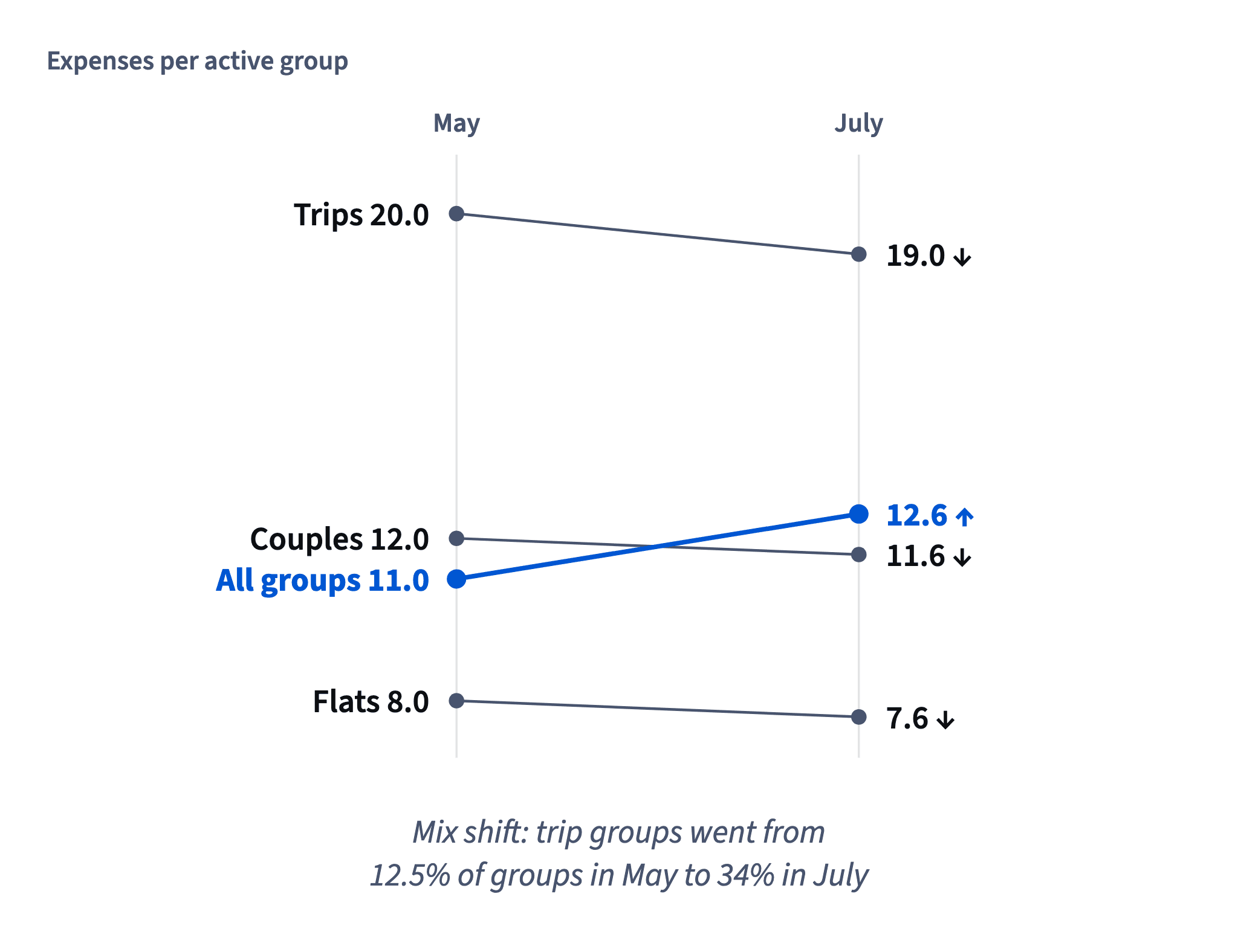
Every type fell, yet the total rose. The export is fine. What changed is who is inside the average. In May, trip groups were 100 of 800 (12.5%); in July, 340 of 1,000 (34%). A trip group adds about 20 expenses a month, a flat about 8. Summer moved weight onto the busiest type, so the weighted average climbed while every type slipped.

That is mix shift: an overall ratio moving because the segment weights changed, not because any segment did. When every segment moves one way and the total the other, the pattern is called Simpson's paradox. Mix shift is the cause; the paradox is the symptom you see.
The practical rule: before crediting a feature for a better ratio, check the ratio inside each segment. A helpful expense screen would show up inside the types. Here it doesn't.
- Do“Each type fell 3–5%; the total rose because trips went from 12.5% to 34% of groups.”
- Don't“Expenses per group +14.5% since the new screen shipped in June.”
Credits the screen for a change in mix.
Freezing the mix
To see what the product did with summer taken out, freeze the weights: apply the new period's segment rates to the old period's segment sizes. Same mix of groups, new behavior.

mix-adjusted rate = Σ (July rate of type × May groups of type) ÷ May groups in total
With Halves's numbers:
(7.6 × 400 + 11.6 × 300 + 19.0 × 100) ÷ 800 = (3,040 + 3,480 + 1,900) ÷ 800 = 8,420 ÷ 800 = 10.525 ≈ 10.53
Against May's 11.0 that's 10.525 ÷ 11.0 − 1 ≈ −4.3%. With the mix held still, groups added slightly fewer expenses, not more. The headline +14.5% was entirely the shift toward trips.
Two things to watch. Use each segment's rate (expenses per group), not its total, or you re-import the old mix by accident. And divide by the frozen total, 800, not by July's 1,000.
The result goes next to the by-type chart as the one-number summary: "10.53 at May's mix vs 11.0 in May".
- Do(7.6 × 400 + 11.6 × 300 + 19.0 × 100) ÷ 800 = 10.53
- Don't(7.6 × 400 + 11.6 × 300 + 19.0 × 100) ÷ 1,000 = 8.42
Divides May-sized weights by July's total.
Freeze both ways and compare
There are two natural frozen mixes, and each answers a slightly different question.
- Old mix, new rates: "if the groups were the same as in May, how would they behave now?" For Halves: 10.53 against May's 11.0, about −4.3%.
- New mix, old rates: "if July's groups behaved as they did in May, what would the ratio be?" (8.0 × 380 + 12.0 × 280 + 20.0 × 340) ÷ 1,000 = 13,200 ÷ 1,000 = 13.2. July actually reached 12.596, so 12.596 ÷ 13.2 − 1 ≈ −4.6%.
The two answers differ a little because the mix itself changed between the periods, and that's normal. What matters is that they agree on the direction and rough size: behavior dipped by about 4–5%, while the headline rose 14.5%.
Use this as a robustness check. If both freezes say the same thing, report one of them and mention the other. If they disagree in direction, the segments are interacting with the mix in a way one number can't summarise, and the by-segment chart has to carry the story on its own.
- Do“At May's mix −4.3%, at July's mix −4.6%: a small dip either way.”
- Don'tCompare 13.2 with May's 11.0 and report +20%.
13.2 uses May's own rates, so the gap is pure mix, not behavior.
When the denominator shrinks
Mix shift isn't the only way a ratio lies. A ratio can also rise because its denominator shrank.
Suppose Halves has 1,000 active groups and 10,000 expenses in one month: 10 per group. The next month, 700 groups and 8,400 expenses: 12 per group, up 20%. Meanwhile total expenses fell 16% and 300 groups went quiet.
If the groups that left were the quietest ones, the average rises without anyone using Halves more: a low-rate segment didn't just shrink, it disappeared.
Two habits protect you:
- Put the counts next to every ratio. "12 per group (8,400 expenses, 700 groups; last month 10,000 and 1,000)" shows the shrinking base at a glance.
- Compare like with like. Did the groups active in both months add more expenses?
Keep volume claims and quality claims apart: each needs its own evidence.
How it fits together: volume says how much, quality how well. A ratio moves with its parts, its mix or its base, so split it and hold the mix still before crediting anything. Next, DAU, WAU, MAU and stickiness applies this to active-user counts.
- Do“12 per group (8,400 expenses, 700 groups), up from 10 (10,000, 1,000); total −16%.”
- Don't“Engagement per group up 20% this month.”
Hides that 300 groups left and total use fell.
Ready to practise?
Answer the lesson's exercises and earn 250 points the first time you finish it.
Start the exercises