

Theory
Pre/post analysis: comparing versions fairly
Pre/post analysis: the rules that make a before-and-after comparison of app versions worth reading.
~10 min read · 9 exercises · 250 points
Before you start
What can we learn without a test?
You work in the product team at Halves, a bill-splitting app for flatmates, couples and trips, with a paid plan, Halves Plus. Not every change gets an A/B test: releases ship, campaigns run, seasons turn, and someone still asks whether the change worked.
This module shows how far data without a coin flip can go: how to build a fair comparison, which explanations it can rule out and where it has to stop. This first lesson compares two app versions before and after a release without being fooled by unfinished cohorts.
Why "users on the new version" is a biased group
Splitting today's users by app version looks like a fair comparison (same week, same weather), but it's tilted before you start: nobody drew lots for the update.
People who open Halves every few days get v4.9.0 within a day or two, often automatically. People who have drifted away sit on v4.8.0 for weeks. So the new-version side is packed with the most loyal users, and it would "win" even if the release changed nothing. When the groups pick themselves like this, it's selection bias; Selection bias: users who do X retain better looks at it in depth.

Without a coin flip you're making an observational comparison, and fairness has to be built in by how you choose the groups. Three rules make a before/after (pre/post) comparison of versions worth reading:
- New users grouped by sign-up date. A newcomer installs whatever is current, so the date decides the version, not their enthusiasm.
- The same fixed window for every cohort, such as active on days 8–14.
- Only cohorts that have lived the whole window.
Even then, it shows a difference, not its cause.
- DoNew users by sign-up date, before vs after 11 May, active on days 8–14, complete cohorts only
- Don'tThis week's users on v4.9.0 vs those still on v4.8.0
Fast updaters are the most active users: the groups picked themselves.
Which cohorts have finished their window?
A cohort belongs in a version comparison only once its whole window has passed. Before that its number is right censored: as Reading a funnel: right censoring and date ranges explains, an unfinished window looks like people who didn't come back. For days 8–14, active_days_8_14 counts only the part of the window that has happened, and a cohort whose day 8 hasn't arrived shows zero by construction.
The dataset has a column that settles this: days_observed, the number of days after sign-up visible on the morning the data was pulled. A cohort is complete when days_observed ≥ 14.

Dataset · 49 rows
Daily sign-up cohorts around v4.9.0
New Halves users from 13 April to 31 May 2026, one row per sign-up day. v4.9.0 was released on 11 May. Data pulled on the morning of 1 June.
First 5 of 49 rows
With data through 31 May, the cutoff is 31 May − 14 days = 17 May. So:
- all 28 v4.8.0 cohorts (13 April – 10 May) are complete;
- of the 21 v4.9.0 cohorts, only 11–17 May are complete: 7 cohorts, 551 users;
- 18–24 May are partly counted (6 cohorts, 473 users);
- 25–31 May haven't reached day 8 at all (7 cohorts, 642 users, all zeros).
Leaving immature cohorts in the average doesn't add information; it adds zeros that mean "not yet".
- DoComplete if days_observed ≥ 14 → 11–17 May, 7 cohorts
- Don'tComplete if days_observed ≥ 8 → 13 cohorts
Day 8 is where the window starts, not where it ends.
The cutoff moves with every data pull
Which cohorts are complete depends on two things: the window and the last day in the data. The rule is the same every time:
Latest complete sign-up date = last day of data − end of the window
For days 8–14 the window ends on day 14. Data through 31 May gives 31 May − 14 = 17 May. A week later, with data through 7 June, it's 7 June − 14 = 24 May, and the v4.9.0 cohorts from 11 to 24 May are complete: 14 cohorts instead of 7.
This is why a pre/post analysis should be rerun rather than defended. The first readout uses the few cohorts that are ready; each later pull adds more complete cohorts and narrows the interval, without changing the method.
Three slips are common: subtracting only the start of the window (day 8), which lets half-observed cohorts in; forgetting that the sign-up day itself is day 0; and using the date the dashboard was opened instead of the last day that's actually in the data. Write both dates on the chart: "data through 7 June; cohorts up to 24 May".
- DoData through 7 June: 7 June − 14 days = 24 May
- Don'tData through 7 June: 7 June − 8 days = 30 May
Uses the start of the window, so cohorts from 25–30 May are only partly counted.
Pool the cohorts, then divide once
Pooling cohorts into one rate (add the counts, then divide once, as Volume, quality and Simpson's paradox shows) has one precondition: every cohort in the pool must be measured the same way.
Each version has many daily cohorts of different sizes: a quiet weekday might bring under 70 new users, a busy Saturday over 100. One rate per version:
Rate = Σ active_days_8_14 ÷ Σ new_users
For v4.8.0, all 28 cohorts are complete: 638 ÷ 2,209 = 28.88%.
Averaging the 28 daily rates instead gives every day the same weight whatever its size. Here it happens to land close (28.94%), but it doesn't have to: a few tiny days with extreme rates can pull a simple mean far from what the users actually did. The pooled rate counts each user once.
Mixing complete and incomplete cohorts, or cohorts with different windows, makes the pooled number meaningless even though the arithmetic is right. That's why the completeness check comes first and the sums second.
- Dov4.8.0: 638 ÷ 2,209 = 28.88%
- Don'tAverage of the 28 daily rates = 28.94%
Close here by luck; it weights a 66-user day like a 105-user day.
Where Maya's 15% came from
Maya's dashboard said week-2 retention fell from 29% to 15%. Both numbers are pooled correctly; the problem is which cohorts went in.
The 15% is all 21 v4.9.0 cohorts: 253 ÷ 1,666 = 15.19%. But only 7 of them had lived through days 8–14. The 7 latest cohorts (25–31 May, 642 users) contribute zeros because their day 8 hadn't arrived, and the 6 before them (18–24 May) were only partly counted. Two-thirds of the denominator is people who simply hadn't had the chance to be retained yet.
Take only the complete cohorts, 11–17 May: 172 ÷ 551 = 31.22%. Against v4.8.0's 28.88%, that's 31.22 − 28.88 = +2.33 pp (from the unrounded rates, 31.216 − 28.882).
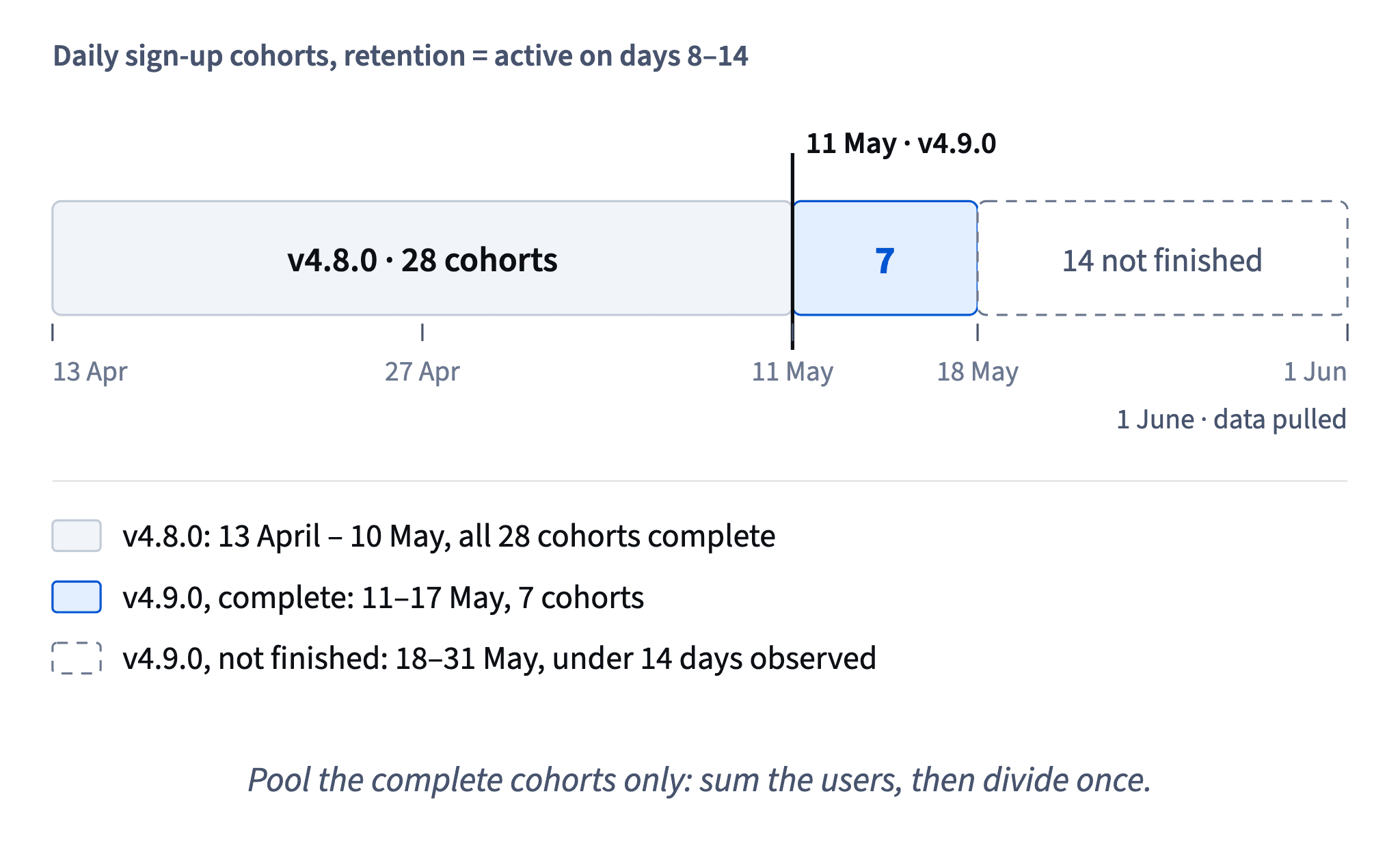
So most of the "drop" was calendar, not code. This pattern appears on almost every dashboard that shows retention by sign-up date: the most recent cohorts always look terrible, because the window is still open. A dashboard that greys out or hides immature cohorts prevents the false alarm before anyone sees it.
- DoComplete v4.9.0 cohorts: 172 ÷ 551 = 31.22%
- Don'tAll v4.9.0 cohorts: 253 ÷ 1,666 = 15.19% → "retention halved"
642 users in the denominator couldn't have been active on days 8–14 yet.
A metric needs a fixed horizon
Theo's report uses "returned at any time since sign-up": 66.8% for v4.8.0 against 47.1% for v4.9.0. It looks like an even bigger drop.
The column has no fixed horizon. A cohort from mid-April had up to 48 days to come back once; a cohort from 31 May had none. Every extra day is another chance to return, so the metric grows with the age of the cohort. Comparing versions on it compares old cohorts with young ones, and the older version wins by construction.
Dataset: Daily sign-up cohorts around v4.9.0 · shown above
The fix is a fixed window: the same days after sign-up for every cohort, such as days 8–14. Then each cohort gets exactly the same number of chances, and only cohorts that have lived the whole window are counted.
"It uses all the data we have" sounds like a virtue, but here it's the problem: "all the data" is a different amount of data for every cohort. A good cohort metric deliberately throws some data away, so that what's left is comparable.
The same applies elsewhere: "total purchases per user", "ever invited a friend", "lifetime revenue" all need a horizon before cohorts can be compared.
- DoActive on days 8–14, cohorts with days_observed ≥ 14
- Don't"Returned at any time": 66.8% (v4.8.0) vs 47.1% (v4.9.0)
Up to 48 days to return against as few as zero.
Completeness isn't enough without a horizon
It's tempting to think the "returned at any time" problem disappears once you keep only complete cohorts. It doesn't.
Take the seven complete v4.9.0 cohorts (11–17 May): 335 of 551 returned at any time, which is 335 ÷ 551 = 60.80%. The v4.8.0 cohorts show 1,476 ÷ 2,209 = 66.82%. On this metric v4.9.0 looks about 6 points worse.
Now compare the fixed window on the same cohorts: 31.22% for v4.9.0 against 28.88% for v4.8.0, about 2.3 points better. Same users, opposite direction.
The reason is age. The complete v4.9.0 cohorts had 14 to 20 days of history by 1 June; the v4.8.0 cohorts had 21 to 48. "Complete" only means each has lived days 8–14; on an open-ended metric the older cohorts still get weeks of extra chances.
So the two rules work together: a fixed window makes every cohort measure the same thing, and completeness makes sure each cohort has finished that window. Either rule alone still lets cohort age into the comparison.
- DoDays 8–14, complete cohorts: 31.22% vs 28.88%
- Don'tAny time, complete cohorts: 60.80% vs 66.82% → "v4.9.0 is worse"
v4.8.0 cohorts still had 21–48 days of chances against 14–20.
What before/after can and can't support
A fair rebuild leaves two questions before anyone calls +2.33 pp (31.22% against 28.88%) an improvement.
Chance. Seven days and 551 users is not much. The Wilson-based 95% interval for the difference runs from about −1.9 to +6.7 pp: anything from a small loss to a decent gain. It rules out a big drop, which answers Maya, but it can't show a gain.
Everything else. An interval only covers random noise. A before/after also contains everything else that changed between April and May: holidays, a campaign, the channels new users came from. No interval separates the release from those.

So the honest answer: no sign that v4.9.0 broke week-2 retention, too little data to claim a gain, and a design that can't prove cause. Rerun as more cohorts complete, and for the next big change keep a randomized holdout group on the old flow (Case: the version or the traffic? shows how).
How it fits together: versions set by sign-up date, one fixed window, complete cohorts and pooled rates make a before/after fair; an interval and the method's limits keep it honest. Next, Traffic mix and seasonality: when the people arriving change too.
- Do"No sign v4.9.0 hurt week-2 retention: +2.33 pp (−1.9 to +6.7). Too early to claim a gain."
- Don't"The new first-expense flow lifted week-2 retention by 2.33 points."
Claims a cause and a gain the interval and the design can't support.
Ready to practise?
Answer the lesson's exercises and earn 250 points the first time you finish it.
Start the exercises