

Theory
Capstone: the unexplained spike
Sign-ups more than doubled over a weekend. List the possible causes, rule them out one by one with the data at hand, and write the memo.
~10 min read · 10 exercises · 250 points
Before you start
Capstone: the unexplained spike
A long weekend is over at Halves, and the dashboard says sign-ups more than doubled. Maya is sure it's the new Android sign-up screen and wants to tell the team. As always, the product team checks with you first.
This capstone brings the course together. You'll list everything that could cause a spike like this, rule the causes out one by one with the data at hand, cheapest check first, and write the memo.
A spike investigation: four families of causes
When a metric jumps, the first story that comes to mind is usually the one somebody wants to tell. A spike investigation replaces it with a list. Almost every sudden change comes from one of four families:
- Tracking: the measurement changed, not the behaviour. A release logs an event twice, a filter breaks, a time zone shifts.
- Traffic: different people arrived. A campaign, a budget change, a store placement, a mention somewhere.
- Product: people behave differently because the product changed. A new screen, a new feature, a price.
- Outside events: the world changed. A holiday, the news, the weather, a rival's outage.
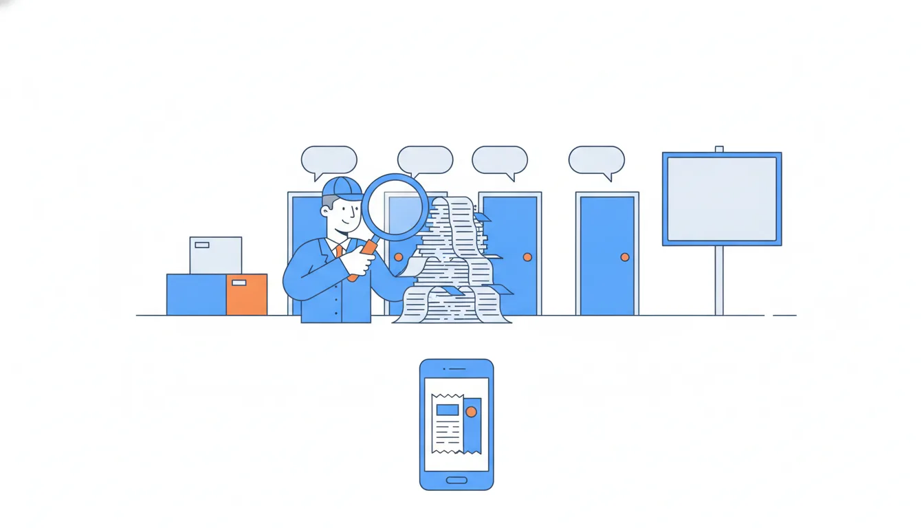
Each family leaves its own fingerprint, so each has a first check: tracking breaks the link between events and people (compare event counts with distinct users), traffic shows up in one channel, a product change shows up where it shipped and not elsewhere, and an outside event changes who arrives and when.
Run the checks cheapest first, write down what each one rules in or out, and keep going until one explanation is left standing.
- Do“Before crediting the new screen: check tracking, then channels, then platforms, then the calendar.”
- Don't“Sign-ups up 156% right after the Android release: the new screen works.”
One family picked by timing alone, the other three never checked.
“Up” needs a baseline, and people need counting
"Up 156%" says nothing until you know up on what. Sign-ups have a weekly rhythm: weekends and Mondays differ from midweek. A fair baseline compares each spike day with the same weekday in recent normal weeks, averaged.
Halves, Saturday 12 – Monday 14 September: Saturdays 29 August and 5 September averaged 269.5 new users, Sundays 272, Mondays 244, so the baseline for the three days is 785.5.
Then measure people, not events: as Totals, unique users and counting traps shows, rows count actions and distinct ids count people. The dashboard counts signup_events: 2,014, which is 2,014 ÷ 785.5 − 1 = +156.4%. Distinct new accounts, new_users: 485 + 478 + 431 = 1,394, which is 1,394 ÷ 785.5 − 1 = +77.47%. The two should be equal; when they split, the gap itself is a clue.
Dataset · 168 rows
Halves sign-ups by day, platform and channel
Saturday 29 August – Friday 18 September 2026; 21 days × 2 platforms × 4 channels.
First 5 of 168 rows
Percent change = spike ÷ baseline − 1. Report it with the baseline in words: "+77% distinct new users against the same weekdays of the two previous weeks". Two habits keep it honest: never compare a weekend with weekdays, and never let a day that may already contain the problem into the baseline.
- DoNew users: 1,394 ÷ 785.5 − 1 = +77.47% against the same weekdays of the two previous weeks.
- Don'tChange = 1,394 ÷ 785.5 = 177%.
That’s the ratio, not the change: subtract 1.
Choosing a baseline that isn’t contaminated
The baseline decides the size of the spike, so pick it before you look at the answer and explain why.
Three rules:
- Same weekdays. A Saturday-to-Monday spike needs Saturdays, Sundays and Mondays to compare with. Midweek days are lower or higher for reasons that have nothing to do with the spike.
- Clean days. The baseline must come from before anything on the change log started. At Halves, Android
5.2began rolling out on Thursday 10 September and was already duplicating events on the 10th and 11th. The days right before the spike are contaminated. - More than one week. Average two or more comparable weeks so one odd day doesn't set the bar.
What goes wrong otherwise: comparing 12–14 September with Wednesday 9 – Friday 11 September gives +91.5% in new users and +141.2% in events. The first mixes weekdays with a holiday weekend; the second also puts duplicate events into the baseline.
The right baseline here: the same weekdays of 29–31 August and 5–7 September, 785.5 in both columns, because no duplicates existed yet.
Dataset: Halves sign-ups by day, platform and channel · shown above
- DoBaseline: Sat–Mon of 29–31 Aug and 5–7 Sep, averaged: 785.5.
- Don'tBaseline: Wed 9 – Fri 11 Sep, the three days just before the spike.
Weekdays against a holiday weekend, with the duplicates already in.
Tracking first: events per user
Tracking is the cheapest family to check and the most embarrassing to miss, so check it first. The simplest test: events per distinct user, split by platform and app version. For a sign-up event it should be 1.00: each person signs up once.
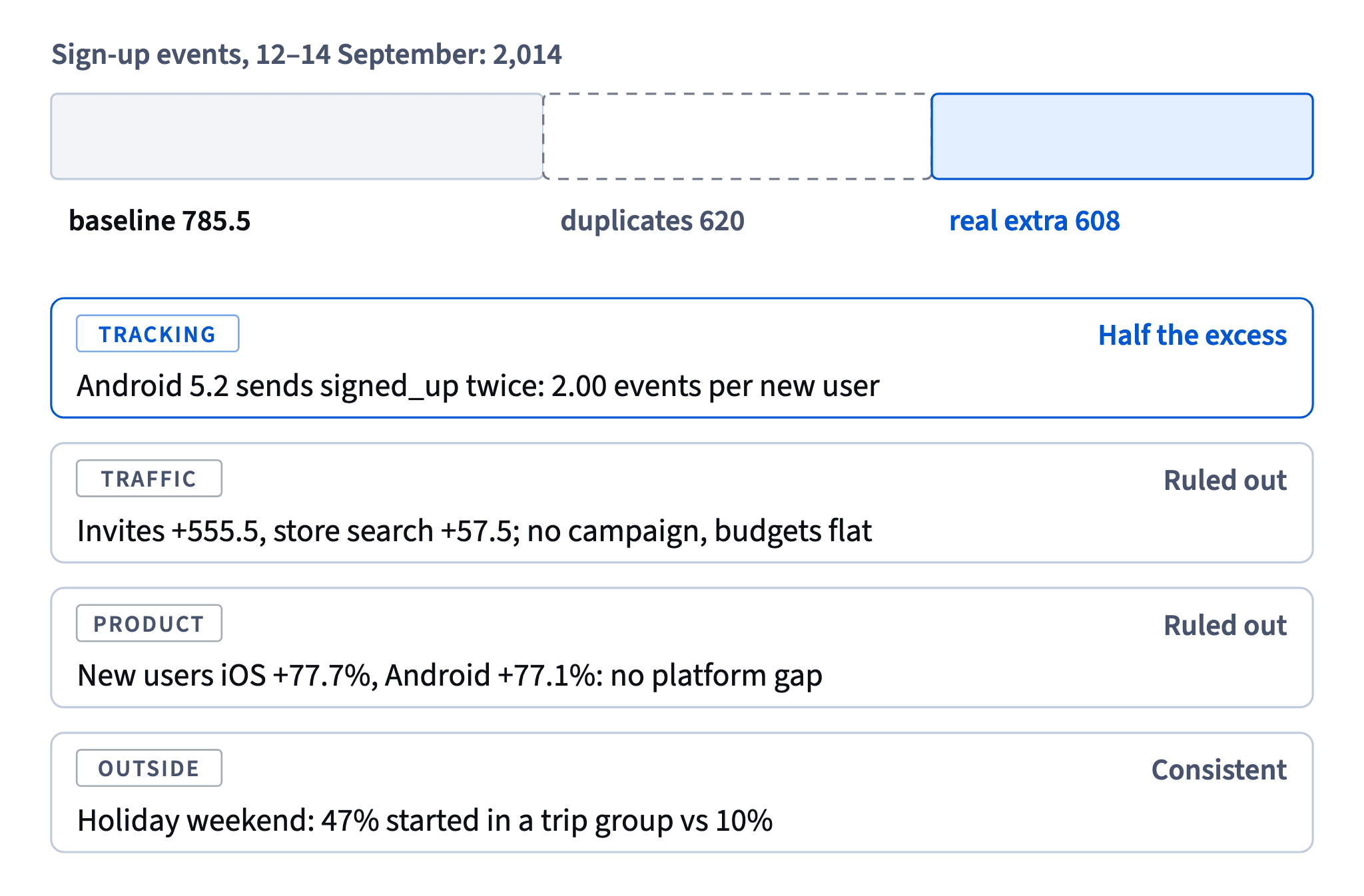
Halves, 12–14 September: iOS 1.00 on all three days, as always; Android 2.00 on all three days. Events minus new users: 2,014 − 1,394 = 620 extra events, all on Android, against zero on the baseline days. That's 620 of the 1,228.5 excess events, 50.5% of the dashboard's jump.
The diagnosis: the new Android sign-up screen sends signed_up twice. Half of the spike Maya saw is a counting bug.

Two things to avoid. Don't stop here: distinct new users still rose 77% on both platforms, so tracking explains the extra events, not the extra people. And don't blame the other platform: iOS's steady 1.00 is exactly what tells you which side is broken.
The lasting fix is a definition that counts people (distinct new accounts) plus a daily alert on events per user by platform and version.
- Do“Android 2.00 events per new user, iOS 1.00: 620 duplicate events, half of the excess.”
- Don't“Android users sign up twice as eagerly on the new screen.”
Two events per person is a logging fault, not enthusiasm.
The timing test: does the effect follow the change?
A suspected cause becomes convincing when the effect follows it in time and in dose: it starts when the change starts, grows as the change reaches more people, and stops when the change is undone.
The Android release is a neat case, because it rolled out in steps. According to the change log, 5.2 reached about 30% of Android sign-ups on 10 September, 70% on the 11th and all of them from the 12th. If every 5.2 sign-up logs two events, events per new user should be about 1.3, 1.7 and then 2.0. The data: 138 ÷ 106 = 1.30 on the 10th, 182 ÷ 107 = 1.70 on the 11th, 2.00 from the 12th to the 15th, 1.50 on the 16th when 5.2.1 shipped at midday, and 1.00 again from the 17th.
That match is far stronger evidence than "the spike came after the release". The same test also shows what the release did not do: iOS, with no release, grew as much as Android in new users.
Use it whenever a change rolls out gradually, by percentage, region or version.
- DoAndroid events per new user: 1.30 (30% rollout), 1.70 (70%), 2.00 (100%), back to 1.00 after the fix.
- Don'tAndroid events per new user on 11 September = 182 ÷ 245 = 0.74.
Divides by both platforms’ new users; use Android’s 107.
Ruling out traffic and product with splits
With tracking explained, the question becomes: where did the real extra people come from? Two splits answer most of it.
By channel, to test traffic. A campaign or a store placement shows up in the channel it ran in. At Halves, invites carry almost all of the excess and the paid channels are flat (against the baseline: invites +555.5, paid social −2, store search ads −2.5). Budgets didn't change either, so no campaign did this.
By platform, to test the product change. The new sign-up screen shipped only on Android, so iOS is a natural comparison group. If the screen had converted more visitors, Android would have grown more. It didn't: iOS new users +77.7%, Android +77.1%. So the release explains the extra events, not the extra people.
"Nothing visible in sign-ups" is not "the screen does nothing": a small effect can hide inside a big outside swing, and only an A/B test of the screen can measure it.
After these splits, one family is left: something outside the product that brought groups and their invited friends.
- Do“Paid channels flat, budgets unchanged; iOS +77.7% vs Android +77.1%: not a campaign, not the release.”
- Don't“Android new users rose 77%, so the new Android screen worked.”
iOS, without the release, rose just as much.
Decompose the excess: where did the extra people come from?
A spike is easier to explain once you split the excess, spike minus baseline, into its parts. The parts must add up to the total, which is itself a check that nothing is missing.
Halves, distinct new users on 12–14 September: 1,394 against a baseline of 785.5, an excess of 608.5. By acquisition channel:
- invites: 902 against 346.5, +555.5;
- store search: 225 against 167.5, +57.5;
- paid social: 177 against 179, −2;
- store search ads: 90 against 92.5, −2.5.
The four add up to 608.5. Invites alone brought 555.5 ÷ 608.5 = 91.3% of the extra people. That points away from anything Halves did (no budget change, no release effect) and towards something that made people form groups and invite friends.
Split by whatever dimension separates the candidate causes: channel for traffic, platform and version for product and tracking, group type or country for outside events. Report the shares, not just the biggest line, and keep negative parts in: they show which channels did nothing.
- DoInvites’ share of the excess = 555.5 ÷ 608.5 = 91.3%.
- Don'tInvites’ share = 902 ÷ 1,394 = 64.7% of the spike.
That’s their share of all spike-day users, normal days’ invites included.
Consistent with is not proven by
The last family left standing is rarely proven: it's the explanation the data is consistent with once the others are ruled out. Say so in those words.
Halves: 12–14 September was a public-holiday long weekend in several of its biggest markets. 47% of spike-day new users started in a trip group, against 10% on the baseline days, and 91% of the extra users came through invites. That fits "friends formed trip groups for the holiday and invited each other", but doesn't prove it: something else could have happened that weekend.

A good memo separates three levels of certainty:
- established: 620 duplicate events from Android
5.2; - ruled out: a paid campaign, the new screen as a source of extra people;
- most likely, not proven: the holiday weekend, so nobody should raise the autumn forecast on it.
How it fits together: count people by a clean definition, compare with a clean baseline, rule out tracking, traffic and product with splits, and call what's left "most likely". The same habits run through the whole course: definitions, cohorts, fair comparisons, tests, money and growth.
- Do“The rise is consistent with the holiday weekend (47% in trip groups vs 10%), though the data can’t prove it.”
- Don't“The holiday caused 608 extra sign-ups; we can plan on more holidays bringing the same.”
Turns a consistent explanation into a proven, repeatable effect.
Ready to practise?
Answer the lesson's exercises and earn 250 points the first time you finish it.
Start the exercises