

Theory
Reading a cohort table
Read rows, columns and diagonals, and average cohorts without the classic mistakes.
~10 min read · 9 exercises · 250 points
Before you start
Can Maya send 43%?
Another board request lands on the Halves product team: the board asks for month-1 retention. Theo averaged the month-1 column of the cohort table and got 43%, and Maya wants to know whether she can send that.
In this lesson you'll read a cohort table three ways, by rows, columns and diagonals, and learn to average cohorts without the classic mistakes.
What a cohort table is made of
A cohort table groups users by when they signed up and follows each group over time.
- Each row is a cohort: everyone who signed up in one month (January, February…), with its size in a
userscolumn. - Each column is an age: month 1, month 2… after the sign-up month.
- Each cell says how many people from that cohort were active at least once in that month of their life. That's monthly bracket retention, stored as a count.
Dataset · 6 rows
Halves monthly cohorts, January–June 2026
Counts of users who opened the app in month k after their sign-up month. Empty: not observable yet.
First 5 of 6 rows
To turn a cell into retention, divide it by its own cohort's size:
Retention in month k = active in month k ÷ users in the cohort
The February cohort has 700 users and 259 of them were active in month 2, so its month-2 retention is 259 ÷ 700 = 37.0%.
The table is a triangle because data stops on a fixed date: the June cohort has no month 1 yet, January has five months. An empty cell is right censoring, "not observable yet", never zero. Treating blanks as zeros would make every recent cohort look like a disaster.
- DoFebruary, month 2: 259 ÷ 700 = 37.0%
- Don'tFebruary, month 2: 259 ÷ 324 (its month-1 count) = 79.9%
That's month-to-month carry-over, not retention of the cohort.
Rows, columns and diagonals
A cohort table can be read in three directions, and each answers a different question.
- A row is one cohort's life: how fast January's sign-ups drop off and where they settle.
- A column compares cohorts at the same age. If month 1 rises from cohort to cohort, something about the first weeks is getting better (or the people arriving are different).
- A diagonal is one calendar month. January's month 4, February's month 3, March's month 2 and April's month 1 all happened in May 2026.
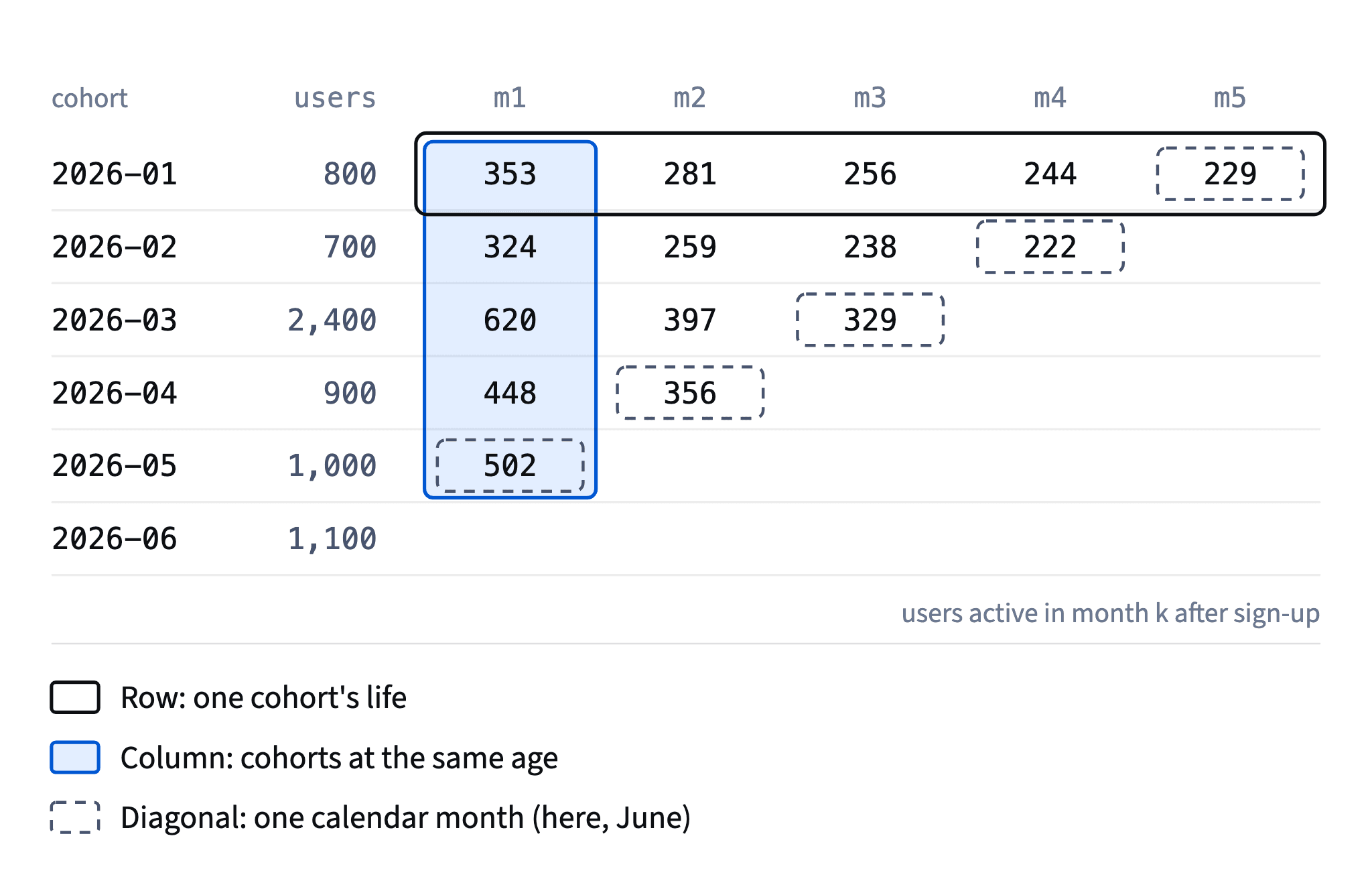
Diagonals matter because calendar events hit every cohort at once. A bug release, a holiday, an outage or a seasonal peak shows up as a stripe running diagonally across the table, at a different age for every cohort. If you only read rows and columns, it looks like several unrelated wobbles.
To find a diagonal, add the cohort's month to the age: cohort month + k = calendar month. February + 2 = April, March + 1 = April, so those two cells sit on the April diagonal.
- DoMay 2026 = Jan m4, Feb m3, Mar m2, Apr m1
- Don'tLooking for a May outage in the May cohort's row
The row is people who signed up in May; the calendar month runs along the diagonal.
Averaging a column: weight by cohort size
To summarize a column into one number, you have two options, and they answer different questions.
The simple mean averages the cohort rates: (44.1 + 46.3 + 25.8 + 49.8 + 50.2) ÷ 5 = 43.2%. It treats every cohort as one vote, so March's 2,400 users count the same as February's 700.
The weighted rate follows the rule for any ratio built from parts: add up the people first, then divide once.
Weighted retention = sum of active users ÷ sum of cohort sizes
For month 1: (353 + 324 + 620 + 448 + 502) ÷ (800 + 700 + 2,400 + 900 + 1,000) = 2,247 ÷ 5,800 = 38.7%.
Dataset: Halves monthly cohorts, January–June 2026 · shown above
The weighted rate answers "what share of everyone who signed up came back in month 1?", which is almost always what a board or an investor means. The simple mean describes no real group of people; it's the retention of an imaginary product where every month brought the same number of users.
The two differ whenever big cohorts have unusual rates. Here March is both the biggest cohort and the weakest one, so the simple mean flatters by 4.5 points.
- Do2,247 active ÷ 5,800 users = 38.7%
- Don't(44.1 + 46.3 + 25.8 + 49.8 + 50.2) ÷ 5 = 43.2% reported as "our month-1 retention"
Gives the 2,400-user March cohort the same weight as a 700-user one.
Report the outlier, don't hide it
A cohort that is unusual for a known reason should be reported with its reason, not hidden. March is such a cohort: a bank paid student-card holders $5 to sign up, sign-ups tripled to 2,400, and only 25.8% came back in month 1. These are incentivized sign-ups: people who came for the reward, many of whom never had a bill to split (module 6 looks at promo waves like this in depth).

You now have two honest numbers:
- 38.7% for everyone who signed up from January to May, March included. That's what happened.
- 47.9% without March: (353 + 324 + 448 + 502) ÷ (800 + 700 + 900 + 1,000) = 1,627 ÷ 3,400. That's an ordinary month.
Send both, and name the reason for the difference in one sentence. Silently dropping March makes the product look better than the money spent on users says. Keeping only the blended number hides that normal months are healthy.
Two shortcuts are worse. The simple mean (43.2%) describes nobody. One cohort, such as May's 50.2%, is a single sample of about a thousand people with roughly ±3 points of noise; it can't stand for the product.
- Do"Month 1: 38.7% for all sign-ups; 47.9% excluding March's paid sign-up promo."
- Don't"Month-1 retention: 47.9%."
Quietly drops the cohort that cost money and retained worst.
The same rule for every column
Once you've decided how to treat an outlier cohort, apply the decision to every column, or the curve stops being comparable from month to month.
For month 2 the cohorts with data are January, February, March and April. Weighted with March: (281 + 259 + 397 + 356) ÷ (800 + 700 + 2,400 + 900) = 1,293 ÷ 4,800 = 26.9%. Without March: (281 + 259 + 356) ÷ (800 + 700 + 900) = 896 ÷ 2,400 = 37.3%.
Dataset: Halves monthly cohorts, January–June 2026 · shown above
So the pair for the board is 38.7% / 47.9% for month 1 and 26.9% / 37.3% for month 2. Each line of that pair uses the same rule.
Two slips are common. One is to drop March from the numerator but keep its 2,400 users in the denominator, which gives 896 ÷ 4,800 = 18.7%, a number that describes nothing. The other is to remove the outlier in one month and keep it in the next, so the curve jumps up and down depending on whether March is in.
Write the rule down next to the table ("excluding the March 2026 paid sign-up cohort") so whoever updates it next month uses it too.
- DoMonth 2 without March: 896 ÷ 2,400 = 37.3%
- Don't896 ÷ 4,800 = 18.7%
March removed from the top but left in the bottom.
Compare months on the same cohorts
Each column of a cohort table covers a different set of cohorts. Month 1 has January to May; month 2 has January to April, because May hasn't lived through its second month yet; month 4 has only January and February.
So when you put column averages next to each other, you compare different groups of people. To see how much retention really drops between two ages, use only the cohorts that have both columns.
For month 1 → month 2, that's January to April:
- month 1: (353 + 324 + 620 + 448) ÷ 4,800 = 1,745 ÷ 4,800 = 36.4%;
- month 2: 1,293 ÷ 4,800 = 26.9%.
Dataset: Halves monthly cohorts, January–June 2026 · shown above
The like-for-like drop is 36.4% → 26.9%, about 9.4 points before rounding. Comparing the all-cohort month 1 (38.7%) with month 2 (26.9%) mixes the strong May cohort into one side only and overstates the drop.
The same rule applies to any curve you draw for a report: fix the set of cohorts first, keep only those old enough to have every point on the curve, and say which ones they are.
- DoJan–Apr only: 36.4% in month 1 → 26.9% in month 2
- Don't"Retention falls from 38.7% to 26.9%."
Month 1 includes May, month 2 doesn't: two different groups.
When an average curve rises for no reason
Build the weighted average for every column and you get 38.7%, 26.9%, 21.1%, then 31.1% and 28.6%. Retention seems to jump up in month 4. Did people come back?
No. Look at the rows: January goes 32.0% → 30.5% from month 3 to month 4, February 34.0% → 31.7%. Every cohort keeps falling. The jump comes from who is in the average: month 3 includes the weak March cohort (13.7%, 2,400 users), month 4 contains only January and February. When the weakest group leaves the average, the average rises, even though no single person changed.

Dataset: Halves monthly cohorts, January–June 2026 · shown above
It's a mix shift, the effect Volume, quality and Simpson's paradox explains for any ratio: the composition changes, not the behavior. Monthly bracket retention of one fixed cohort can wobble a little, since people can skip a month and come back, but a clear rise in an average curve is almost always a change of cohorts.
The check takes a minute: before you explain a rise, see whether every row also rises. If the rows fall and the average rises, the cohorts in the average changed.
- DoCheck rows: Jan 32.0% → 30.5%, Feb 34.0% → 31.7%. Both fall.
- Don't"Users re-engage in month 4: retention rises from 21.1% to 31.1%."
March left the average; nobody came back.
Did onboarding improve? Read the column
Onboarding affects people in their first weeks, so its effect shows up at a fixed age: in the first column, across cohorts that joined before and after the change. January 44.1%, February 46.3%, April 49.8%, May 50.2%, with March set aside as the promo outlier.
Dataset: Halves monthly cohorts, January–June 2026 · shown above
A row can't answer this. January's users went through the old onboarding, so the April change can only touch them as a calendar event on a diagonal.
Even the column gives only a careful answer:
- Noise. A cohort of 800–1,000 users carries about ±3–3.5 points of uncertainty, so a 4–5 point rise is plausible but not certain.
- Before/after is not an experiment. The season, the traffic mix or another release could explain part of it.
The honest wording is "probably slightly better", plus a plan to confirm it: watch the next cohorts, or test the next change against a control group.
How it fits together: rows show how a cohort ages, columns compare cohorts at one age, diagonals show calendar events. Summarize by pooling, on the same cohorts, with one outlier rule. Next, The plateau: retention and product-market fit reads the shape of one curve.
- DoMonth-1 column: 44.1, 46.3 (before) vs 49.8, 50.2 (after) → "probably slightly better"
- Don't"January's row fell after April, so the new onboarding hurt retention."
January's users never saw the new onboarding; a row shows ageing, not onboarding.
Ready to practise?
Answer the lesson's exercises and earn 250 points the first time you finish it.
Start the exercises